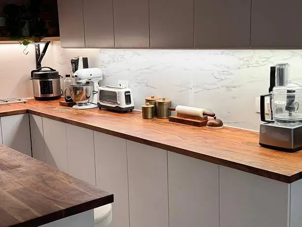
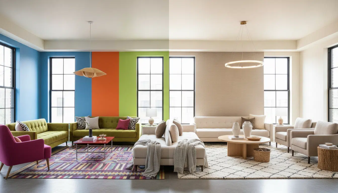
Choosing a color palette may seem pretty straightforward, but creating a cohesive look takes more than picking a few colors you love. Lighting, undertones, existing finishes, and the way colors work together can all change how a space feels. Here are some of the most common color palette mistakes to watch out for, and how to avoid them.
1. Ignoring Warm and Cool Undertones
Two colors might look like a perfect match on a screen or paint card, but once they’re in the same room, they can look surprisingly different. Often, the culprit is undertones. A white might have warm, creamy undertones, for example, while a nearby gray leans cooler with subtle blue tones. Wood, stone, beige, and even certain shades of blue can create the same challenge.
Before settling on a palette, compare your samples with the flooring, cabinetry, furniture, and other finishes already in the room. Seeing everything together makes it much easier to spot colors that clash and create a palette that feels cohesive.
2. Choosing Colors Without Considering the Light
A paint color can look completely different from one room to another. Natural light shifts throughout the day, while artificial lighting can make colors appear warmer, cooler, brighter, or more muted. A shade that feels beautiful in a bright, sunny room may look flat in a space with less natural light.
Room orientation and window size can also make a difference. Before making a final decision, look at paint colors and material samples in the actual room at different times of day. This is especially important in naturally bright coastal areas.
For example, skilled interior designers in Fort Lauderdale consider natural light, room orientation, and the surrounding environment when selecting colors and materials, helping create spaces that feel balanced throughout the day.
3. Choosing Paint Before Looking at Fixed Finishes
Paint is one of the easiest things to change in a room, so it doesn’t always make sense to choose it first. Flooring, countertops, tile, cabinetry, stone, large rugs, and major furniture pieces tend to be much harder, and more expensive, to replace.
A better approach is to start with the fixed finishes or strongest piece in the room, then build the color palette around what’s already there. This makes it easier to choose wall colors that complement the space rather than compete with elements you’re likely to keep for years.
4. Creating Too Little Contrast
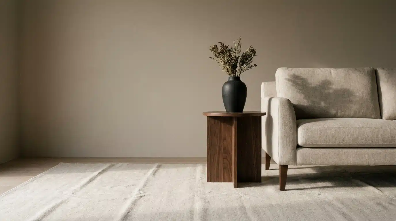
Neutral interiors can feel calm and sophisticated, but they can also fall a little flat when everything sits in the same tonal range. Light walls, soft upholstery, pale rugs, and natural wood may work well together, but without some contrast, the room can lose depth.
Adding contrast doesn’t mean you need a bold statement color. Darker wood, black accents, deeper textiles, or subtle shifts in tone can add just enough definition. Mixing lighter and darker elements helps the space feel more layered, welcoming, and naturally balanced.
5. Using Too Many Competing Colors
The opposite can happen when too many bold colors compete for attention. A colorful interior can feel lively and expressive, but it still needs a sense of balance. When everything is trying to be the focal point, the room can quickly start to feel overwhelming.
The 60-30-10 rule can be a helpful starting point: choose one dominant color, a supporting shade, and a smaller accent. It doesn’t have to be followed exactly. The idea is simply to give bold colors room to shine without making every part of the room compete for attention.
6. Treating the Color Palette as Paint Only
An interior color palette goes well beyond the walls. The furniture, materials, and smaller details throughout a room all play a part in how the colors come together. Even the simplest touches can make a difference in how balanced and inviting the space feels.
Repeating a color in subtle ways can help tie everything together without making the room feel too coordinated. A shade from a rug, for example, might show up again in artwork or a cushion. Texture can add even more depth, helping a neutral palette feel warm, layered, and full of character.
7. Ignoring the Room’s Purpose and the Rest of the Home
A successful room color palette should work with the way you actually use the space. A bedroom might feel best with softer, more calming tones, while a living or dining area may benefit from a little more contrast and energy. Color psychology can be a helpful guide, but ultimately, the colors you choose should feel right for the people who live in the home.
It’s also worth thinking about how each room connects to the spaces around it. A whole-home color palette doesn’t mean every room needs to match. Repeating similar undertones, levels of saturation, or a few favorite shades can create a natural sense of flow while still allowing each room to have its own personality.
8. Failing to Test the Full Palette Before Committing
Testing a single paint swatch is a good place to start, but seeing the full palette together can tell you so much more. Before making any major purchases, bring your paint samples and key materials into the room and take a moment to see how everything looks together in the space.
A simple sample board can also help you catch details that might be easy to overlook when shopping online or viewing materials separately in a showroom. Look at your samples throughout the day and from different parts of the room. The goal isn’t to overthink every choice, but to understand how the colors, materials, lighting, and existing finishes come together to create a space that feels right.
A Cohesive Color Palette Starts With the Whole Room
Avoiding common color palette mistakes starts with looking at the room as a whole rather than making isolated choices. The most successful interiors bring color, lighting, materials, finishes, and furnishings together in a way that feels intentional without looking overly coordinated.
Take the time to compare samples, consider how the space will be used, and see how each element works with the rest of the home. At the end of the day, the best color palette is one that feels comfortable, welcoming, and uniquely yours.