Subway tile is not disappearing from kitchens. It is too useful, too adaptable, and too familiar to vanish completely.
But it is no longer the automatic answer for every backsplash. More homeowners want a kitchen that feels personal, layered, and specific to the home, not like the same white rectangle repeated from one renovation to the next.
Designers are responding with backsplash choices that still perform well in cooking zones, but bring more texture, color, scale, and craft into the kitchen.
Architectural Digest notes that white subway tile will always be a correct material, but backsplash design can be far more rewarding when it supports the architectural goals of the home.
That shift is exactly why tile brands with a stronger material point of view have become more relevant. clé, for example, approaches tile less as a flat wall covering and more as a surface with character, through glaze movement, handmade variation, pigment, texture, and historical references.
1. Zellige and handmade-look tile

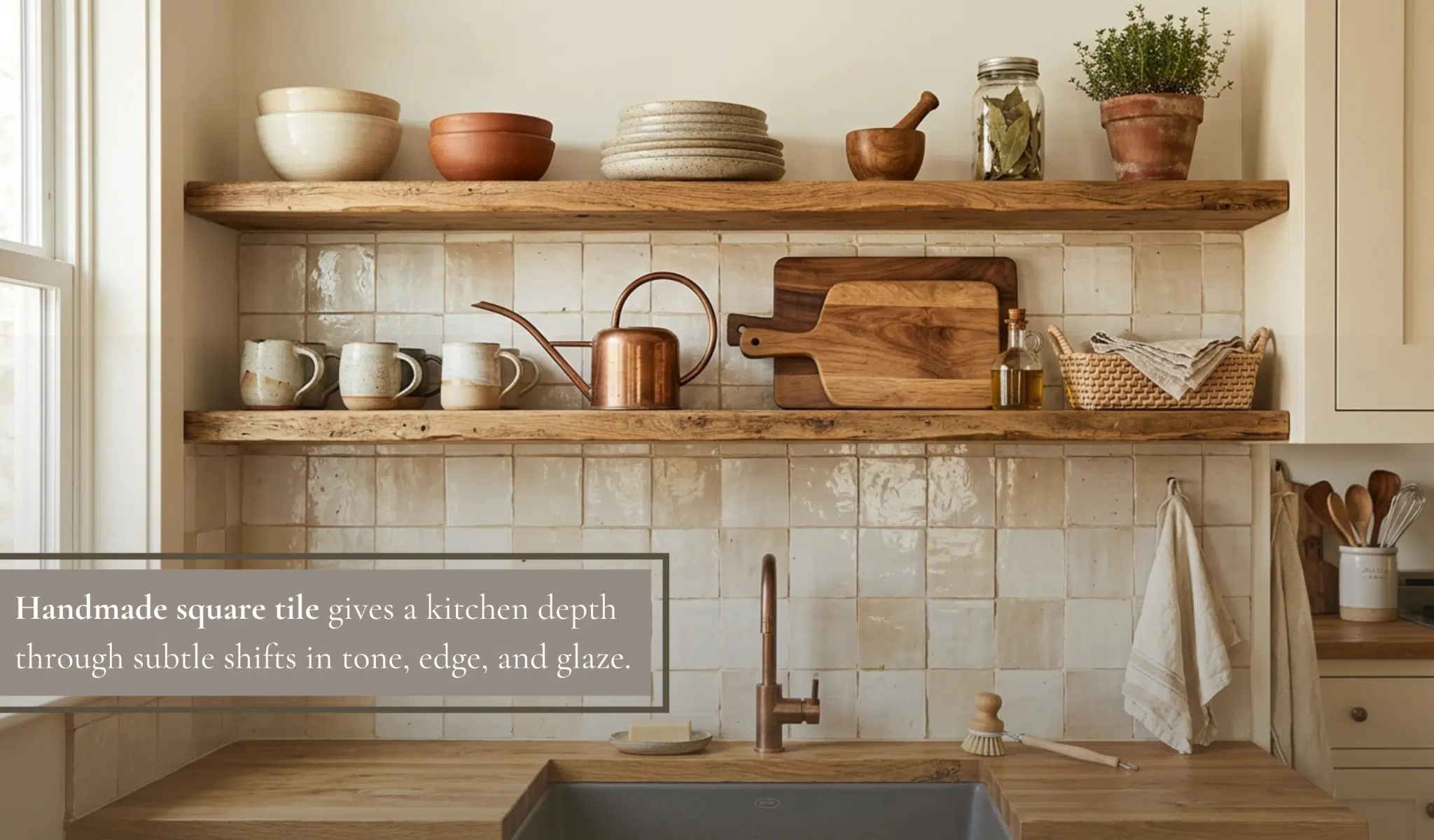
Zellige and zellige-inspired tiles have become one of the clearest alternatives to basic subway tile. The shape can still be simple, often square or rectangular, but the surface does the design work. Slight irregularity, tonal variation, and glaze pooling create a backsplash that changes throughout the day.
This works especially well in kitchens with simple cabinets and quiet counters.
A creamy zellige-style backsplash can soften a modern kitchen.
A green or blue glaze can make a neutral kitchen feel more atmospheric.
A deeper brown, black, or oxblood tone can give a range wall a more dramatic, restaurant-like quality.
A backsplash trend only works if the wall behind it is ready for the level of finish the tile demands. Zellige can forgive some visual irregularity, but a square grid or stacked ceramic layout will expose uneven drywall, old adhesive, and poorly planned cuts quickly. Before committing to a more tailored look, homeowners planning to install kitchen backsplash tile over existing walls should treat surface preparation as part of the design decision, not just an installation step.
The important detail is expectation setting. Handmade and handmade-look tiles are not meant to look machine-perfect. Installers need to blend pieces from multiple boxes, review variation before setting, and plan grout joints carefully.
2. Full-height backsplashes

Instead of stopping tile at the underside of the upper cabinets, designers are carrying backsplashes to the ceiling, around hoods, or across entire range walls. The result feels more intentional and built-in.
This works with many materials: ceramic, porcelain, stone-look tile, zellige, handmade tile, or slab-style surfaces. The appeal of using the same material as the countertop for a backsplash because it creates a clean, sleek look. But tile can create a similar sense of continuity with more pattern, grout rhythm, and surface texture.
Full-height tile requires more planning than a standard backsplash.
Outlet locations, shelf brackets, hood width, corner returns, and edge trim all need to be coordinated before installation. When those details are handled well, the wall feels designed from the start rather than finished at the end.
3. Hand-painted ceramic tile

Hand-painted tile is one of the strongest choices for homeowners who want character without relying on a busy countertop or ornate cabinetry. The pattern can be traditional, geometric, botanical, or abstract, but the effect is usually warmer than a printed or mass-produced surface.
Good Housekeeping’s 2026 backsplash trend coverage notes that designers are seeing more clients open to strong statements through hand-painted or specialty tile, while subway tile is no longer the default.
The best placement is often controlled rather than wall-to-wall. Use hand-painted ceramic behind the range, inside an alcove, around a coffee bar, or across one short backsplash run. This gives the tile enough presence without overwhelming the room.
4. Square ceramic grids

Square ceramic tile has returned because it feels simple, honest, and graphic without being loud. A 4-by-4 or 6-by-6 grid can make a backsplash feel calmer than subway tile, especially when the grout color closely matches the tile.
This look works in both modern and traditional kitchens. In a modern kitchen, a square grid can echo flat-panel cabinets and slab counters. In a cottage or old-house kitchen, it can feel more modest and timeless than a high-contrast pattern.
The installation quality matters. A square grid makes crooked walls, uneven counters, and inconsistent joints easier to see. The installer should establish level reference lines, review where cuts will land, and center the layout where the eye naturally goes, usually behind the range or sink.
5. Terrazzo-look tile

Terrazzo is useful because it brings patterns without a traditional repeat. Instead of florals, stripes, or geometric motifs, it relies on chips of color suspended in a field. That makes it playful but still sophisticated.
A pale terrazzo backsplash can brighten a small kitchen. A dark terrazzo can create depth behind open shelving or a range. Warm aggregate tones can tie together wood cabinets, brass hardware, and stone counters.
Terrazzo-look porcelain is often the most practical route for residential backsplashes because it is easier to source, easier to install, and usually simpler to maintain than traditional terrazzo. True terrazzo or cementitious versions may need more specialized installation and care, so homeowners should check manufacturer guidance before choosing.
6. Textured and dimensional tile
Texture is replacing patterns in many kitchens. Instead of choosing a bold color or motif, designers are using fluted, ribbed, beveled, wavy, or dimensional tile to create shadow.
This approach is especially effective in tonal kitchens. A white textured tile against white cabinets can still feel layered because the surface catches light differently. A matte clay or sand-colored dimensional tile can add warmth without competing with wood or stone.
There is one practical caution. Deeply textured tile can be harder to clean behind a range, where grease and cooking residue collect. For heavy cooking zones, choose a texture that is noticeable but not overly grooved, or use the most textured tile on a sink wall, bar wall, or display area rather than directly behind the cooktop.
7. Mixed-material backsplashes

Some designers are moving away from one-material backsplashes entirely. A kitchen might combine ceramic tile with a short stone riser, a slab panel behind the range, painted plaster above tile, or wood shelving layered over a tiled wall.
Livingetc recently described layered backsplashes as a way to make a kitchen feel richer, with materials and finishes interacting to create more depth. This is a good direction for homeowners who like the practicality of tile but do not want the entire wall to feel uniform.
The key is restraint. Too many materials can make a small kitchen look chopped up. Choose one dominant surface, then one supporting material. For example, a handmade ceramic tile field with a stone shelf, or a slab range panel framed by quieter ceramic tile.
8. Color-rich ceramic tile
Designers are using ceramic tile to bring color back into kitchens in a way that feels more permanent than paint but less overwhelming than colored cabinetry. Olive, indigo, tobacco, butter yellow, oxblood, soft blue, and clay are all strong backsplash colors when paired with the right counters and cabinets.
The most successful versions are not flat blocks of color. They have glaze variation, tonal depth, or a handmade surface that keeps the color from feeling too commercial. This is where brands like clé fit naturally, since many of their collections are built around surface character, pigment, and variation rather than uniformity.
For homeowners who are nervous about color, start with the room’s fixed elements. A green backsplash can connect to a garden view. A blue tile can cool down warm wood. A clay tone can make white cabinets feel less sterile.
What to consider before replacing subway tile
Before choosing a more expressive backsplash, homeowners should think about scale, cleaning, and sequencing.
Scale matters because a tile that looks beautiful as a sample can feel busy across an entire wall. Always view several pieces together, especially with handmade, hand-painted, or terrazzo tile.
Cleaning matters because the backsplash is a working surface. Glossy ceramic is often easier to wipe down, while matte, textured, crackle-glazed, cement, or porous materials may need more care. Manufacturer maintenance guidance should be reviewed before installation.
Sequencing matters because backsplash tile is one of the last visible layers in a kitchen, but many of its details are decided earlier. Countertop thickness, cabinet layout, hood placement, outlet locations, and open shelving all affect the final tile layout.
A good installer will plan the backsplash before setting the first tile. That includes avoiding awkward slivers, centering the layout, confirming edge conditions, and checking whether specialty tiles need sealing before or after grouting.
The bottom line
Basic subway tile still has a place, but designers are no longer treating it as the only tasteful option. The strongest backsplash trends are not about novelty. They are about surface character.
Zellige brings light and variation. Full-height tile makes the kitchen feel more architectural. Hand-painted ceramic adds artistry. Square grids offer quiet order. Terrazzo introduces movement. Dimensional tile creates shadow. Mixed materials add depth. Color-rich ceramic gives the kitchen a stronger point of view.
The best choice is the one that supports how the kitchen is used and how it should feel. A backsplash should protect the wall, but it should also help the kitchen look more resolved. That is the real alternative to basic subway tile: not just a different shape, but a more intentional surface.