
Right now, we’re seeing a huge wave of corporate identity rebranding across Southeast hubs like Georgia, North Carolina, and Tennessee.
And as it turns out, companies that embrace modern, distinctive visuals are winning bigger partnerships than those sticking to generic or dated aesthetics, which fall behind.
If you, too, are considering refreshing your brand, but by honoring Southern roots thoughtfully rather than literally, this article will show you how to do it.
Keep reading to find out more.
1. Dominant Design Trends Among Southeastern Companies
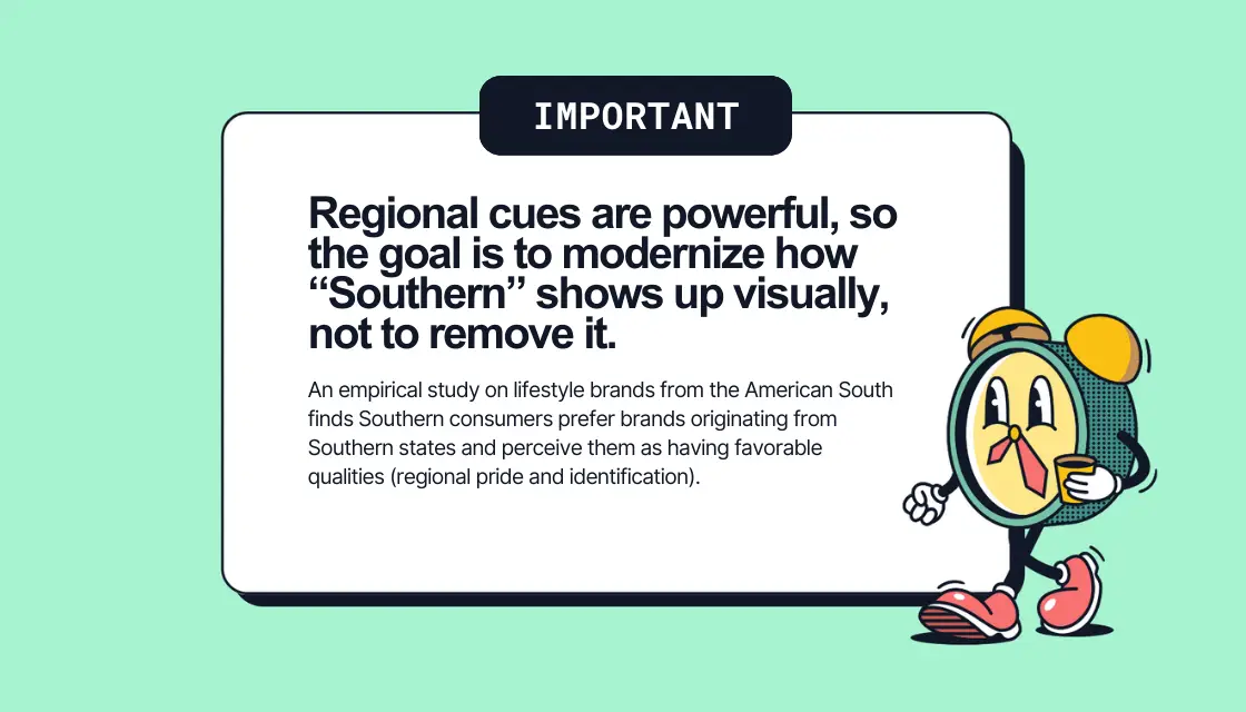
Everyone knows that Southern brands love a cozy, familiar vibe that signals hospitality and down-to-earth values.
In fact, regional guides specifically tell brands, “Lean into rustic charm, nostalgic elements, and warm colors if you want to resonate here.”
But the thing is, when everyone leans on the same cues, logos start to blur together. Heritage badges, peaches, magnolias, state outlines—sure, they work, but as we’ve learned at Design Rush, they don’t stand out.
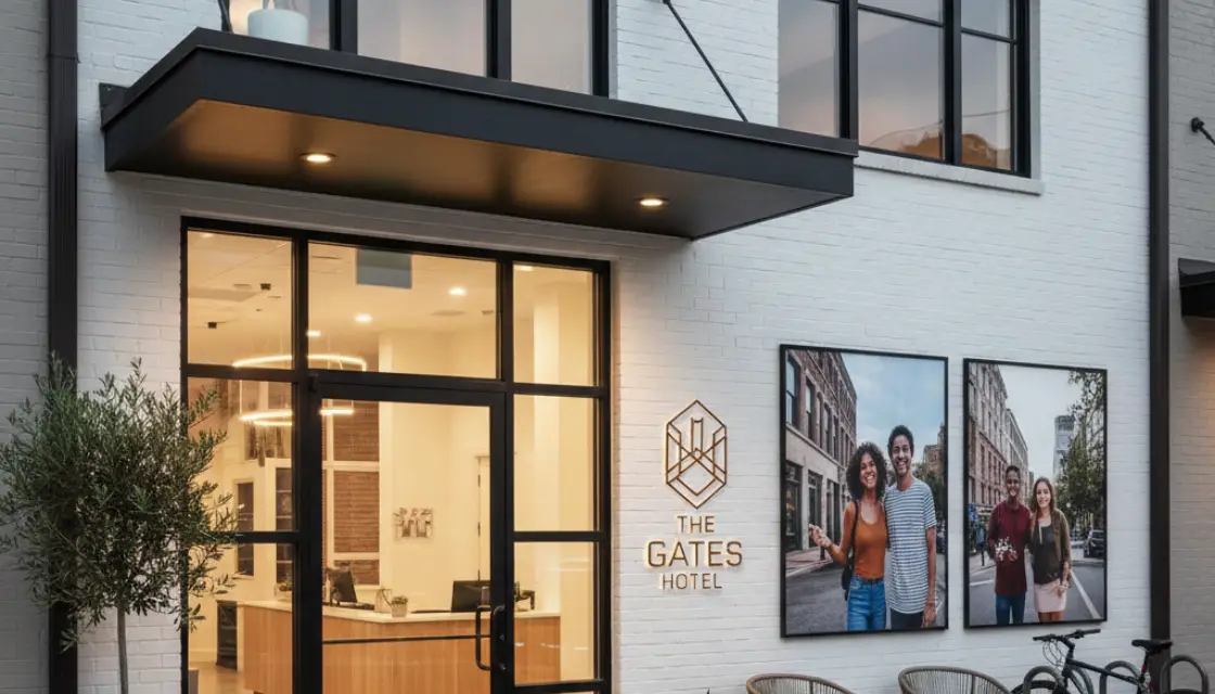
So, what does? Well, a recent report on Atlanta notes firms are moving away from outdated or generic branding like this and redesigning for mobile, high-resolution displays, and social channels.
This proves that distinctive and digitally savvy systems (akin to those that West Coast brands lean into) are what really helps Southeastern brands perform better.
2. What High-Performing Southeastern Brands Look Like
To find out what high-performing (read: corporate identities that measurably support business outcomes) Southeastern brands look like, start with large cities like Atlanta.
Here, brands are moving toward minimalist, high-authority visuals that signal stability, sophistication, and global competitiveness. Think New York or San Francisco benchmarks rather than small-town Southern cues.
That shift creates a gap within the Southeast itself: big-market, globally minded brands versus more traditional, local players.
Across regions, identities that outperform share some clear traits. We’ve singled out five key patterns that make brands stand out, and they’re coming up in the next section.
3. Five Ways to Reimagine Southeastern Corporate Identities
If the goal is to stand out in the Southeast without losing regional authenticity, go for combining local roots with forward-looking design.
Here’s how the best-performing brands do it:
1. Start With a Sharper Narrative
Don’t just lean into Southern charm. Tell a story that frames it in a modern, ambitious way.
Think of the designers reimagining a “flag for the South”: they avoided mythical, backward-looking symbols and used fabric and angles to signal diversity and progress.
For an Atlanta logistics or fintech company, the story could be “connecting global flows with Southern reliability” instead of “Atlanta-based and friendly.” That narrative guides every visual choice (type, color, imagery, motion, layout, etc.), so the brand feels purposeful.
2. Modernize the Visual Grammar
When we say “visual grammar,” we mean the language a brand speaks through its design.
You can do this via:
- Typography, by swapping ornate scripts for a modern serif paired with a geometric or humanist sans.
- Color choice, by retaining typical Southern warm accents but anchoring them with strong darks and precise neutrals so the palette feels premium.
- Logo, by moving away from literal magnolias or state outlines and using concept-driven forms like intersecting lines (other simplified symbols) that convey meaning without clichés.
- Layout and composition, by embracing minimalism and whitespace, modular grids, and flexible templates that adapt across screens.
The goal is to communicate sophistication, purpose, and distinction while still hinting at regional personality.
3. Build a Full, Flexible System
All top-performing brands operate as systems, not static logos. That means adaptable palettes, responsive logos, motion, dimensionality, and scalable elements are standard.
Southeastern brands can emulate this with the following:
- A primary logotype with a simplified symbol for small sizes.
- Motion guidelines for video, UI, and ads.
- Consistent photography and illustration that balances modern industry cues with subtle Southern textures.
Fun fact: Across sectors, corporate identity rebranding commonly delivers 2,000–3,500% ROI over about three years via revenue growth, higher average order values, and lower acquisition costs.
4. Shift From Nostalgia to an Inclusive, Present-Tense South
Like we said, one way to do this is to move beyond agrarian, antebellum, or overtly nostalgic imagery.
Instead, highlight today’s South, which is objectively urban, multicultural, and tech-enabled.
Pro tip: Cast diverse talent in your photos. Photograph among modern skylines, co-working spaces, and fabrication labs. Also, try using abstract patterns rather than Confederate or old South references.
5. Align With Measurable Business Outcomes
This one’s pretty obvious, but every design choice should tie to performance.
When choosing a graphic design solution for your new corporate identity, ask yourself:
- Does it attract the right partners and grow deal size?
- Does it appeal to top talent in a competitive market?
- Does it improve digital KPIs like navigation, readability, and recall across apps and sites?
When identity supports these goals, branding starts being strategic.