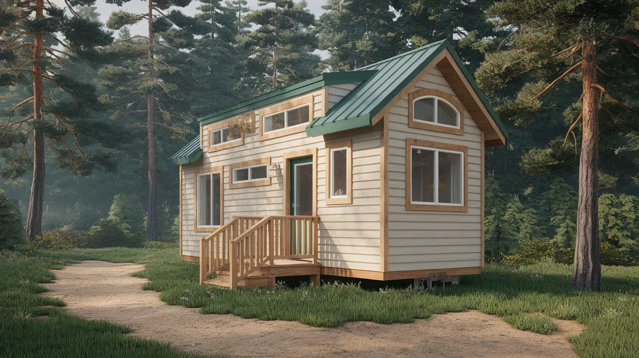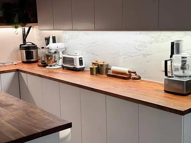
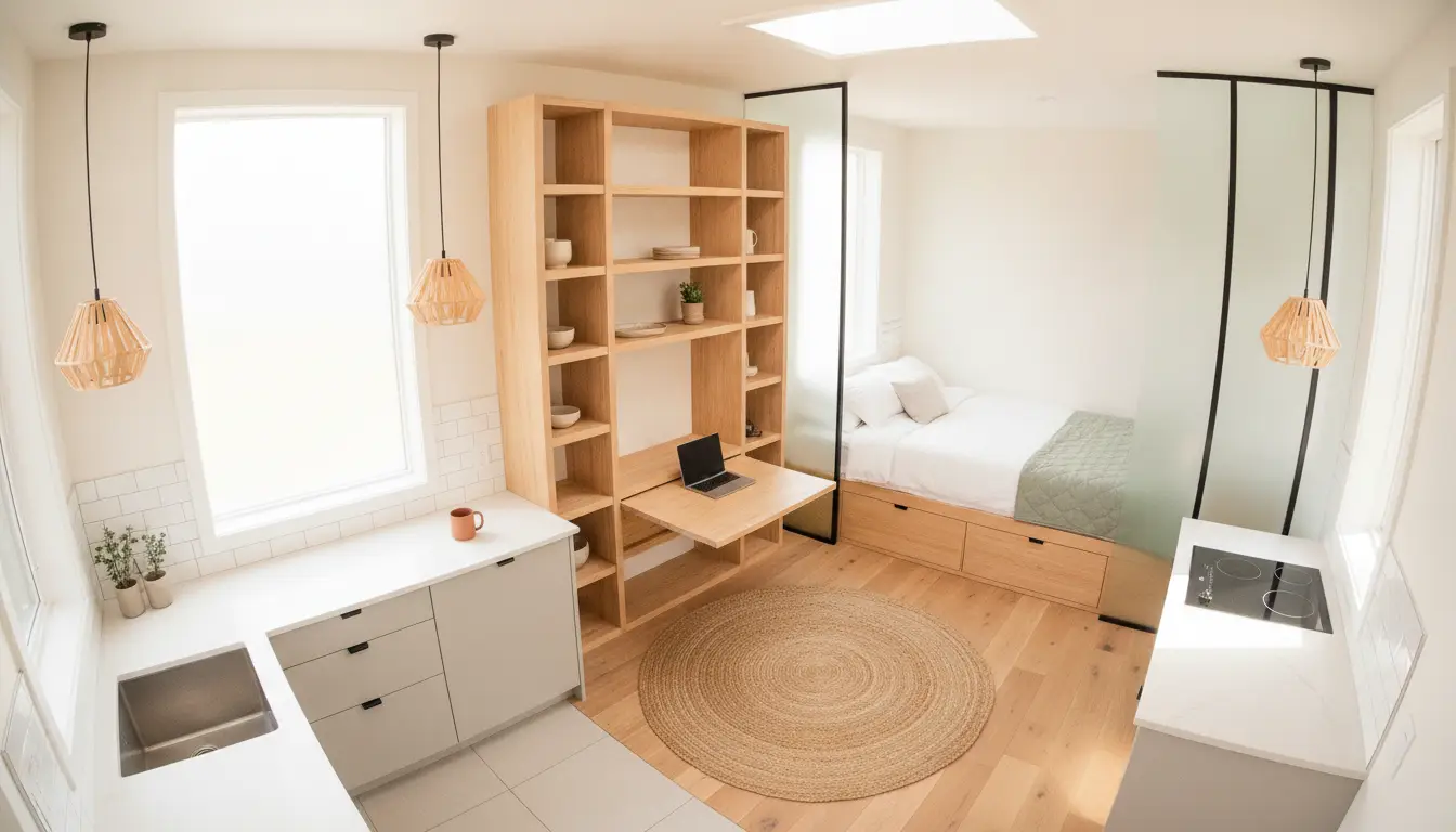
Tiny homes and commercial offices have more in common than you might think.
Both have to fit a lot of life into a limited footprint. An office has to accommodate meetings, focused work, storage and circulation often in less than 200 square feet per person.
A tiny home has to do the same: sleeping, cooking, working, relaxing and storing everything you own, sometimes in 300 square feet total.
Office designers have spent decades solving this problem. They’ve developed principles that make small spaces feel functional and comfortable. The good news is that most of those principles translate directly to compact apartments.
Here are six lessons that are worth borrowing.
Commercial Space Planning Principles
Principle | In a Commercial Office | In a Tiny Home |
Zone-based planning | Activity zones across open floors | Sleep, cook, work, relax areas — no walls needed |
Circulation first | Corridors mapped before furniture | Walking paths decided before buying anything |
Multi-function furniture | Folding tables, stacking chairs, mobile storage | Storage beds, fold-down desks, ottoman storage |
Vertical space | Floor-to-ceiling shelving and storage | Tall shelves, ceiling hooks, high-mounted rails |
Define without walls | Rugs, lighting, glass partitions | Rugs, pendants, flooring changes |
Light strategy | Layered lighting, glass walls, light finishes | Same: maximize windows, mirrors, light colors |
1. Think in Zones, Not Rooms
In most commercial offices, there are no separate rooms for every activity. Instead, designers create zones – areas that signal a specific purpose through furniture placement, rugs and lighting:
- Collaboration zone
- Focus zone.
- Lounge zone.
All of them can exist in the same open space without a single wall between them.
Tiny homes work exactly the same way. Designing zones across an open plan gives you all the function without losing any floor space.
A simple way to start:
- Put your sleep zone at one end of the space, away from the main entry.
- Keep the cooking and eating zone near your utilities – don’t fight the plumbing.
- Use a low bookshelf, a sofa back, or a change in flooring to mark where one zone ends and another begins.
- Your work zone doesn’t need a full room – a desk, good lighting and a clear sight line is enough.
2. Plan Circulation Before You Buy Furniture
The first thing a commercial space planner does is figure out how people move through a space. Furniture comes later.
In a tiny home, getting this backward is one of the most common mistakes. You buy a great sofa, a big bed, a solid dining table and then realize you’re squeezing past all of it every time you move from the kitchen to the bathroom. At that point, fixing it means moving everything.
Plan circulation first:
- Identify your main paths: from the door to the kitchen, from the kitchen to the bathroom, from the bed to the exit.
- Keep those paths at least 36 inches wide. That’s the commercial standard for comfortable single-person movement.
- Everything else fills in around the paths.
- Walk your planned layout before buying anything. Tape it out on the floor if you have to.
3. Make Every Piece of Furniture Do Two Jobs
Commercial designers rarely specify furniture that does only one thing. You’ll usually see a conference table that folds against the wall and turns into a training room. Or a storage unit that divides a space also serves as a bookshelf.
In a small home, this is a handy space survival strategy. If a piece of furniture does one job and sits unused for most of the day, it’s just taking up floor space you don’t have.
Some reliable multi-function picks are:
- Bed with built-in drawers that eliminates the need for a separate dresser.
- Dining table with fold-down leaves – seats two daily, four or six when needed.
- Ottoman with interior storage for seating, a footrest and a place to put things.
- Desk that folds against the wall and creates an office when you need it, floor space when you don’t.
- Sofa with a pull-out bed – guest room without a guest room.
4. Use Vertical Space the Way Office Designers Do
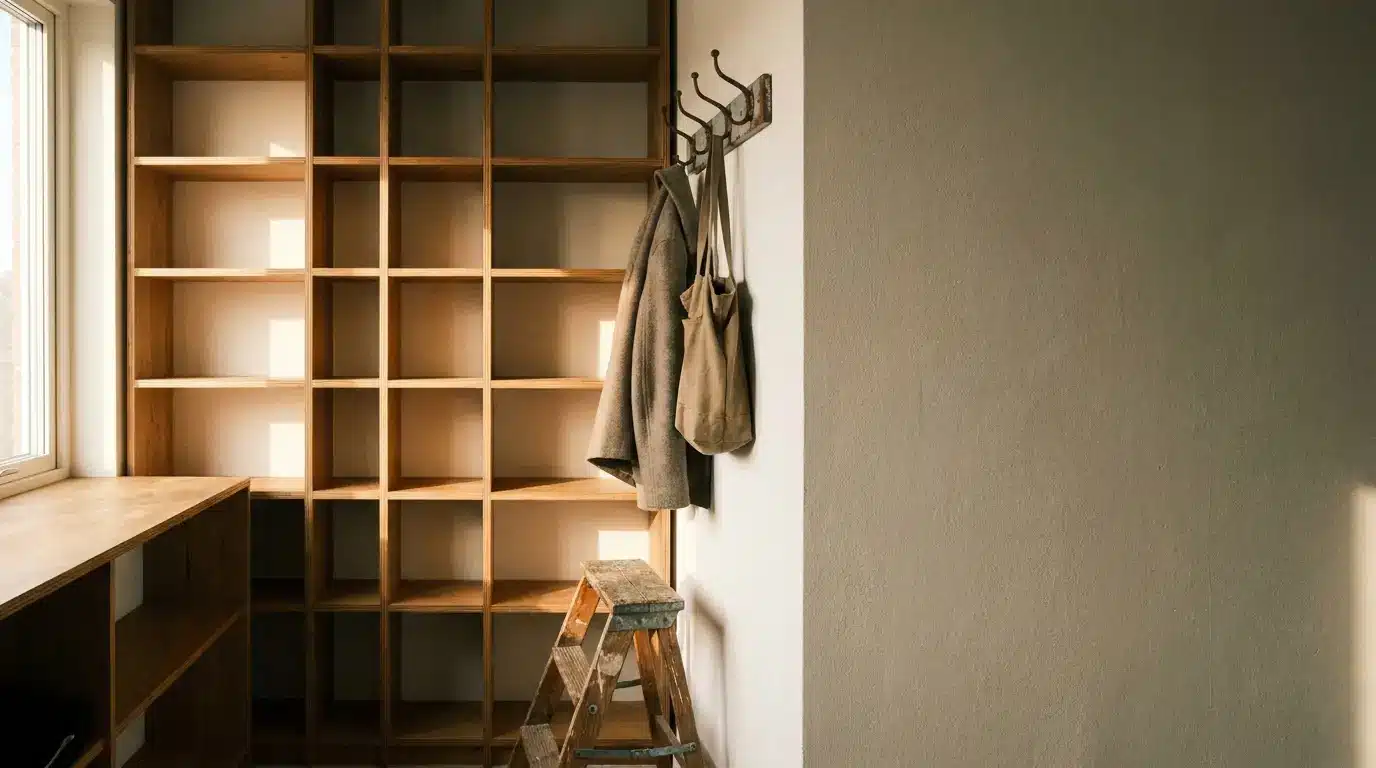
Most people stop decorating and storing at about five feet. The space from five feet to the ceiling usually stays empty.
In a commercial office, that space is prime real estate. Floor-to-ceiling shelving, high-mounted storage, overhead rails and wall-mounted equipment are standard practice because they add capacity without using any floor area.
The same logic applies in small houses. Your ceiling is probably 8 to 10 feet high. That’s a lot of unused space. Here’s what you can do with this space:
- Run shelving all the way to the ceiling. Use a small step stool for the top shelf rather than wasting the space.
- Install hooks, rails and hanging storage as high as practical. The closer to the ceiling, the more floor you keep.
- Choose tall, narrow furniture over wide, low furniture whenever possible.
5. Define Areas Without Building Walls
Open-plan offices prove something important: you don’t need walls to make different parts of a space feel distinct.
Designers use rugs, pendant lighting, furniture arrangements, material changes and glass partitions to signal this is a different area. No need to reduce usable square footage or block light.
This is one of the most powerful principles in commercial space planning, says Valeria Narseeva, a commercial interior designer at TNT Commercial, a Charlotte-based firm specializing in workplace design, furniture procurement and commercial space planning.
And it scales down to any size home.
Some specific ways to try this in your place:
- Use a rug to anchor each main zone. The rug’s edge is the zone’s edge.
- Hang a pendant light wherever you want a space to feel intentional and distinct.
- A change in flooring material (wood to tile, for example) communicates a boundary without any construction.
- In larger tiny homes or loft-style builds, a glass partition between a work nook and a sleeping area keeps visual openness while creating real separation.
6. Let Light Do Its Job
Light is the most underrated space-planning tool in any home and commercial designers use it deliberately.
Glass walls let light pass through an entire floor. Light-colored finishes reflect rather than absorb it. Layered lighting (ambient overhead light, task lighting at work surfaces, accent lighting in corners) makes a space feel larger and more considered at every time of day.
In a limited space, the right lighting is one of the highest-return investments you can make. It costs less than adding square footage and has a bigger impact on how the space actually feels to live in.
Here are some tips to get the most out of the light available:
- Don’t block windows with furniture. Keep the area in front of your windows clear.
- Place a large mirror on the wall opposite your main window. It bounces light across the whole space.
- Light walls and ceilings reflect more light. Dark colors absorb it and make rooms feel smaller.
- Layer your lighting: one overhead source isn’t enough. Add task lights at the desk and kitchen and accent lights at shelving or in corners.
- If you’re building or renovating, a skylight is one of the best moves you can make in a tiny home. Natural light from above changes a space completely.
Start With One Principle
You don’t have to overhaul your entire home to see a difference. Pick one of these lessons, the one that feels most relevant to your current frustration with your space, and apply it this week.
You can zone your layout without moving a single wall or trade one single-use piece of furniture for something that earns its square footage. Small changes, applied with intention, add up faster than you’d expect.
Commercial designers work within tight constraints every day and still manage to create spaces people actually want to be in. There’s no reason your tiny home can’t do the same.