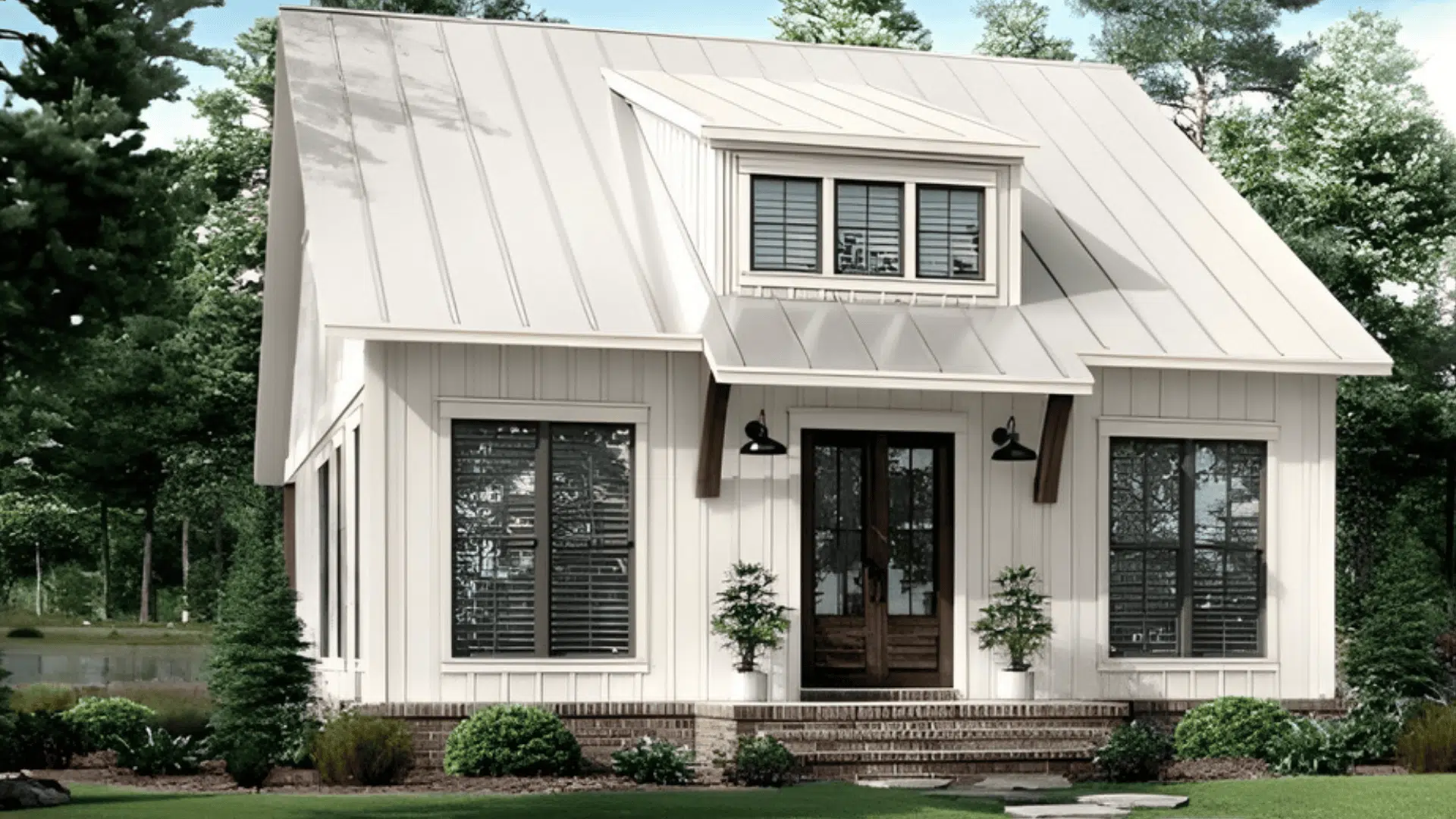
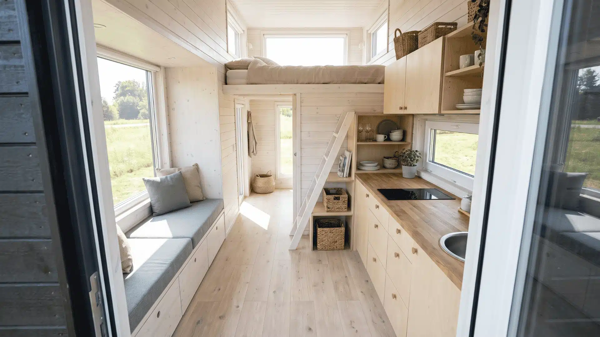
Tiny living looks effortless in photos: clean lines, warm light, everything in its place. The reality of interior tiny homes is more demanding than that.
The gap between a tiny home that feels intentional and one that feels like a compromise almost never comes down to budget or square footage.
It comes down to understanding how spatial decisions interact and why getting one wrong can unravel everything around it.
If you’ve ever wondered why a tiny home that looked perfect online feels completely different in person, the answer starts well before the furniture arrives.
Why Interior Tiny Homes Feel Different from Just a Small Room
A tiny home interior works differently from a small room in a conventional house because every design element, material, color, storage, and layout operates as a system rather than independently.
In a regular home, bold tile choices are limited to the bathroom. In a tiny home, that same choice affects how the whole space reads. Every decision touches the next one.
The real challenge isn’t storage; it’s visual density. Most interior design styles for small spaces treat this as a decorating problem, but in a tiny home, it’s a spatial one.
A cluttered tiny home isn’t cluttered because it lacks clever storage. It’s cluttered because too many visual signals compete at the same time. What makes a tiny home feel open isn’t square footage. It’s the absence of visual noise.
When materials are consistent and sightlines run clear end-to-end, your brain processes the room faster. That ease is what “feeling bigger” actually means, and getting it right makes the square footage almost irrelevant.
How Floor Plans Shape What’s Possible Inside
The floor plan of a tiny home isn’t just a spatial arrangement; it’s the primary constraint that determines which interior design strategies will and won’t work.
Tiny home plans fall into one of three archetypes: open single-zone, loft-over-main, and no-loft single-level. Each one makes design decisions for you before you choose a single finish.
| Layout Type | How It Works | Benefits | Challenges |
|---|---|---|---|
| Open Single-Zone Layouts | Uses one open area without walls, relying on sightlines, natural light, and design elements to separate living zones. | Creates a spacious feel with strong light flow, making the interior feel larger. | Zones can feel undefined without clear separation. Floor transitions, ceiling details, and lighting need to create structure. |
| Loft and Split-Level Layouts | Uses elevated sleeping areas to save floor space and create separation between functions. | Frees up the main floor for other uses and creates the classic tiny home look. | Lofts reduce ceiling height below, limit light, restrict tall storage options, and require stairs or ladders. The main floor needs careful planning to avoid feeling cramped. |
| No-Loft and Accessible Layouts | Keeps the sleeping area on the main floor with full ceiling height throughout the home. | Allows better natural light, taller cabinetry, easier movement, and a more comfortable daily layout. | Requires a longer or wider footprint to fit a ground-level sleeping area. It may increase the overall size of the home. |
The best tiny home layout depends on how you use the space every day. Open plans maximize flexibility, lofts save floor area, and no-loft designs prioritize comfort and accessibility
Interior Design Styles for Small Spaces that Make Every Square Foot Count
These ideas translate directly into decisions you can make about materials, layout, light, and what to leave out. Each one addresses a specific design problem and tells you exactly what to do about it.
1. Build Your Color Story Around One Dominant Neutral
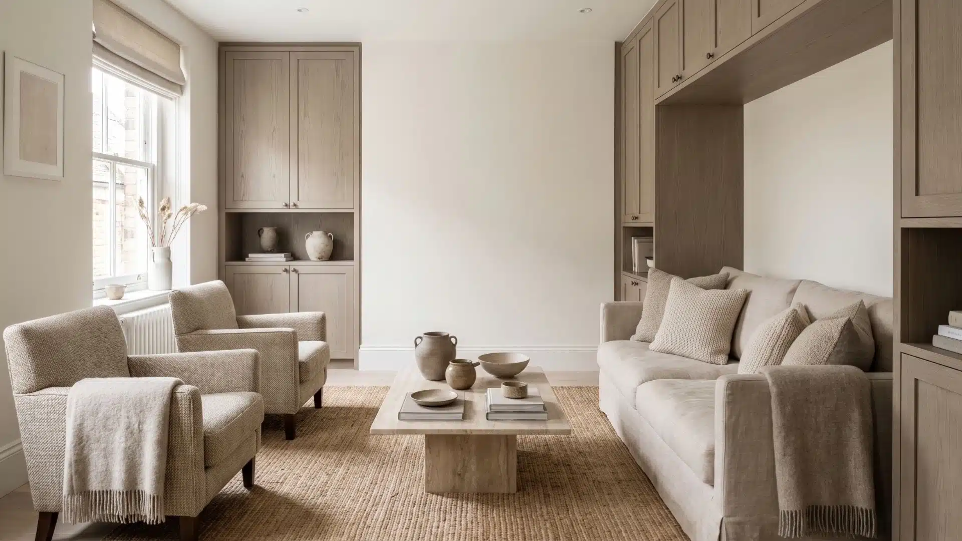
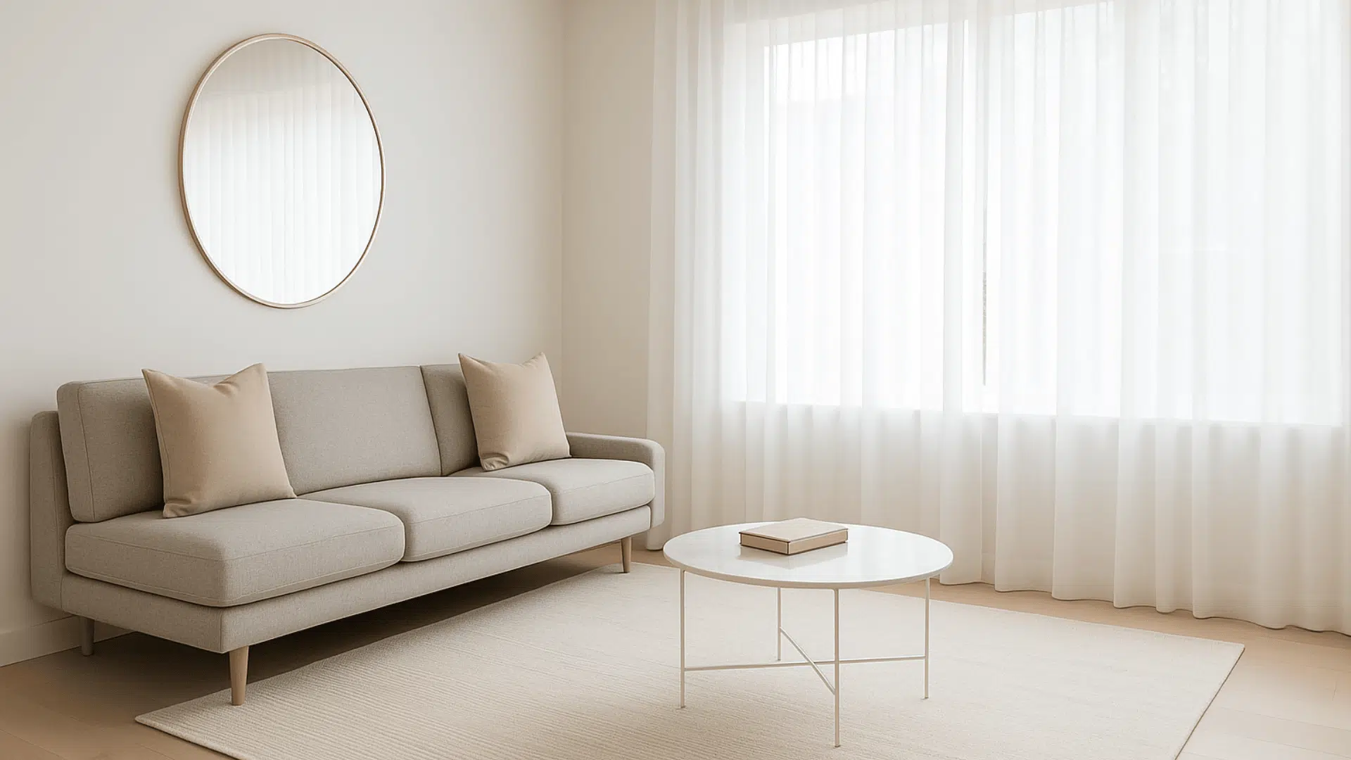
Too many colors can make a tiny home feel busy fast. Start with one main neutral, like warm white, soft beige, greige, or light linen, and let it become the base for the whole space.
Once your main color is set, bring personality through texture instead of adding more shades. A woven rug, matte walls, natural wood, and linen curtains can create depth without making the room feel crowded.
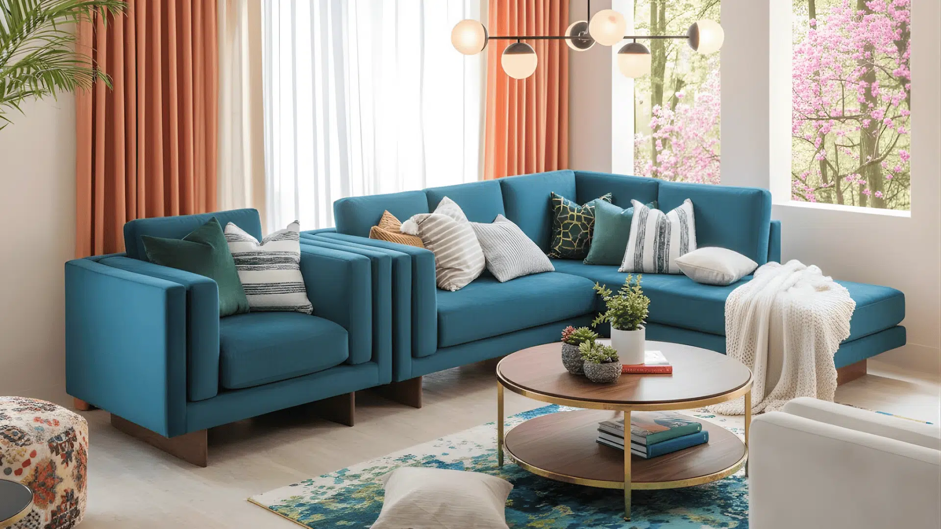
If you want a stronger color, use it carefully. Pick one area, like a kitchen island, backsplash, or accent wall, so it feels like a choice instead of visual noise.
2. Treat the Kitchen as Architecture, Not Furniture
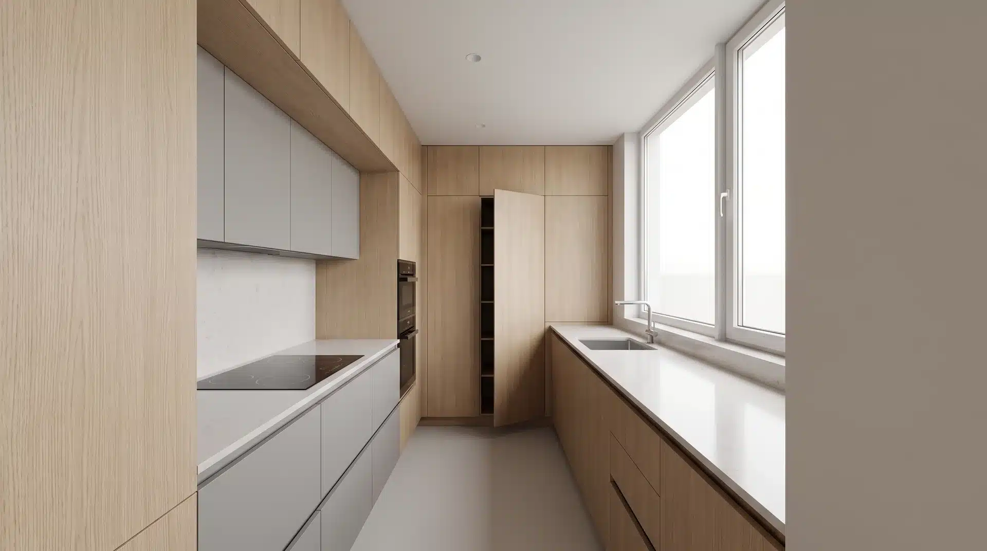
A tiny kitchen feels bigger when it looks like it belongs to the home itself. Cabinets that stop randomly or leave gaps can make the space feel broken into separate pieces.
Run cabinets from floor to ceiling whenever possible, especially in narrow layouts. Full-height storage uses wasted space while helping the kitchen blend into the walls.
Think of the kitchen as part of the structure, not a collection of cabinets placed inside a room. The cleaner the lines, the calmer the space feels.
3. Use a Loft for Sleep, Not Living
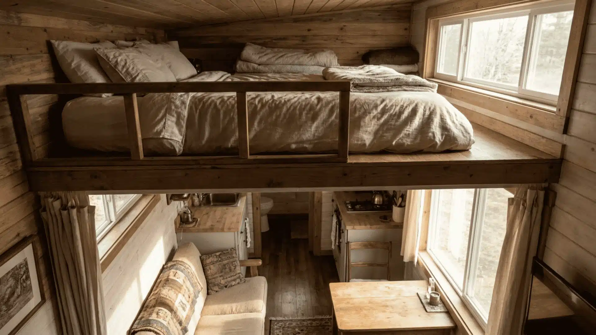
A loft works best when it has one clear purpose: sleeping. Trying to squeeze in a desk, storage area, or reading corner often makes the space feel cramped.
Keep your loft simple with a comfortable mattress, good lighting, and only the storage you actually need nearby. A small shelf or built-in drawer is usually enough.
When the loft stays dedicated to rest, the main living area gets more breathing room. Each part of the home feels easier to use.
4. Choose One Statement Material and Let Everything Else Recede
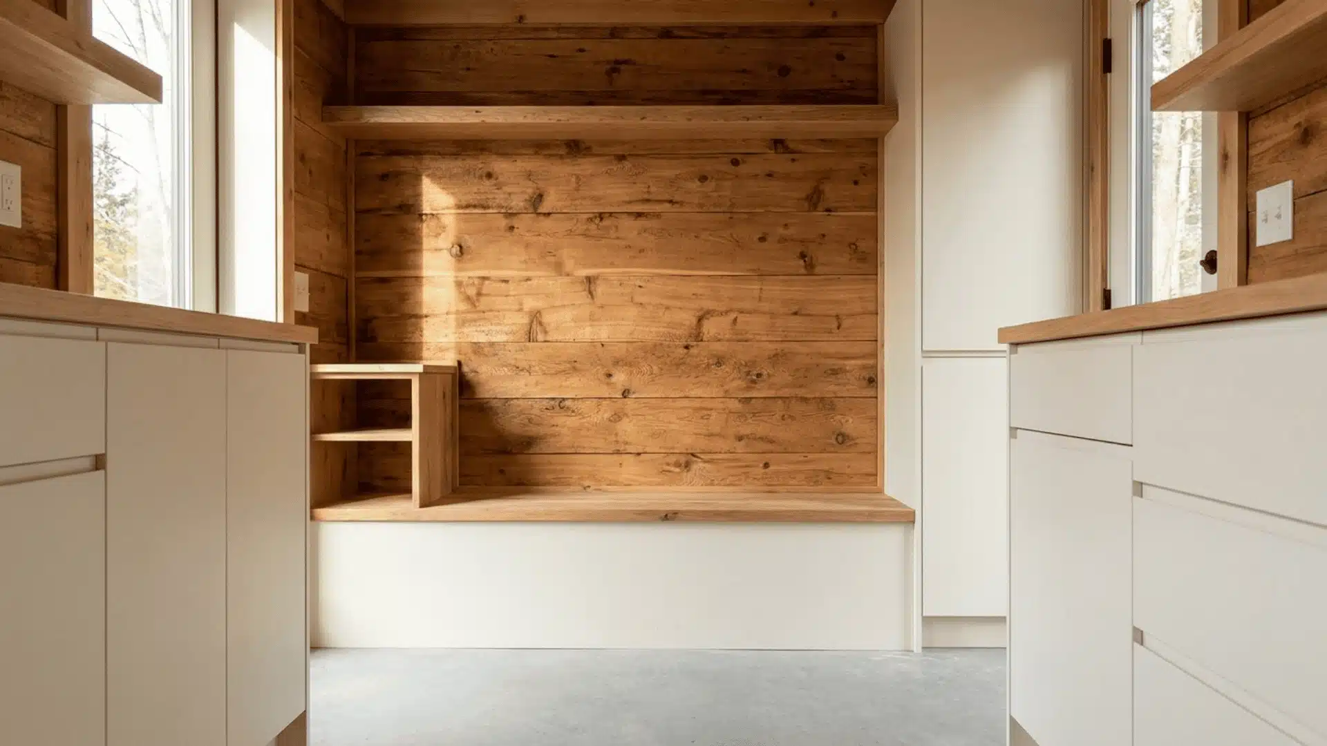
Tiny homes look more intentional when they are not competing with too many finishes. Pick one material you love and let it become the feature that gives the space character.
It could be warm wood walls, handmade tiles, stone counters, or textured plaster. Once you choose it, keep nearby finishes simple so it gets the attention.
Instead of adding more details everywhere, let one strong material carry the design. The result feels calmer and more personal.
5. Replace Room Dividers with Ceiling and Floor Transitions
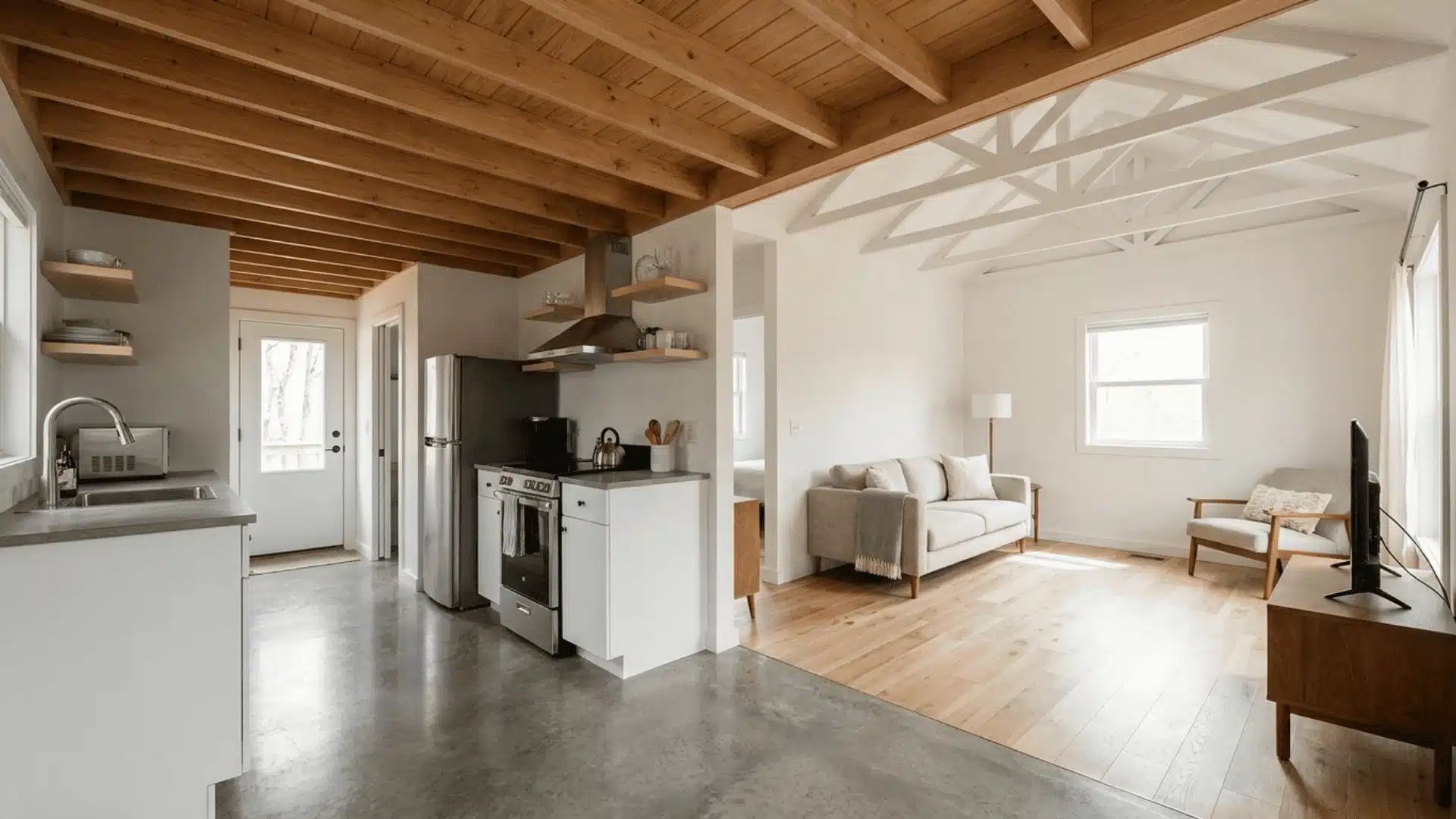
Walls can make a tiny home feel chopped up. You can create separate areas without blocking light or taking away valuable space.
Use small changes to show where one zone ends and another begins. A raised bed platform, a different floor texture, or a lower ceiling section can create clear boundaries.
These subtle changes help your brain understand the layout while keeping the home open and connected.
6. Install Full-Height Windows on the Longest Wall
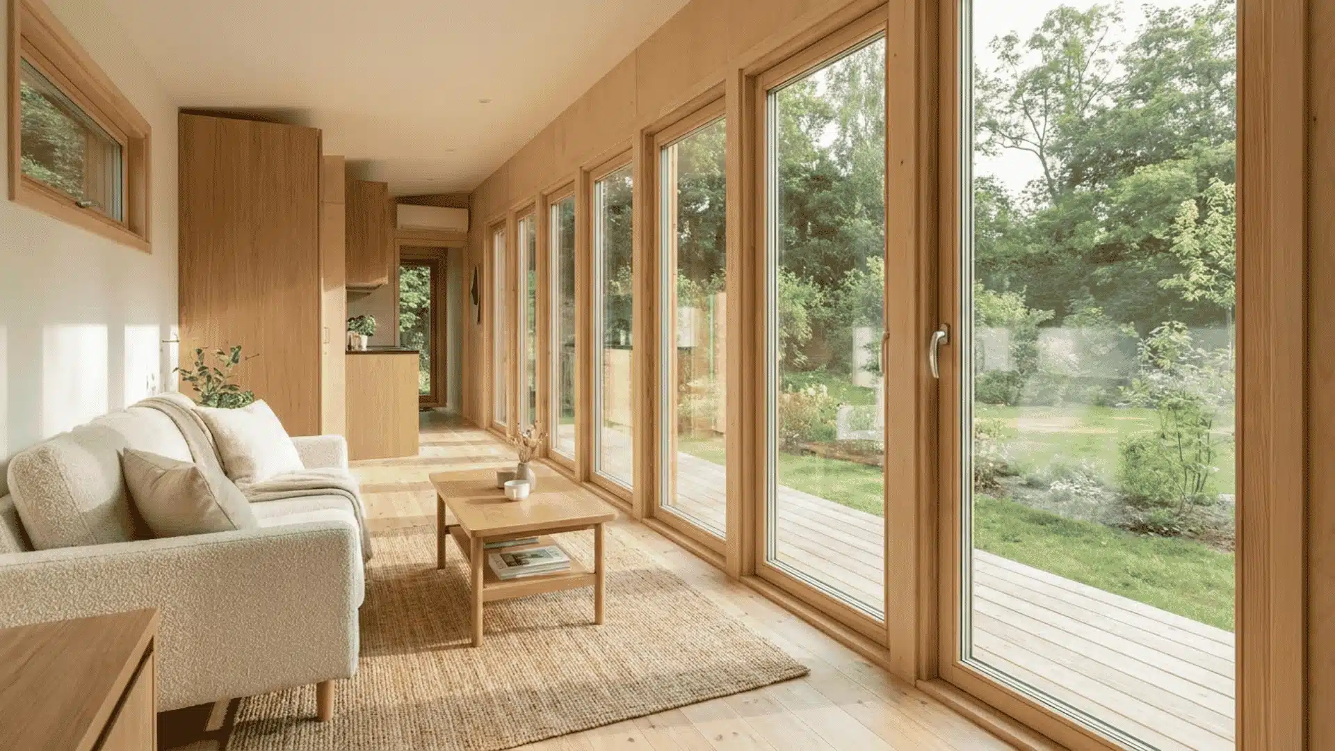
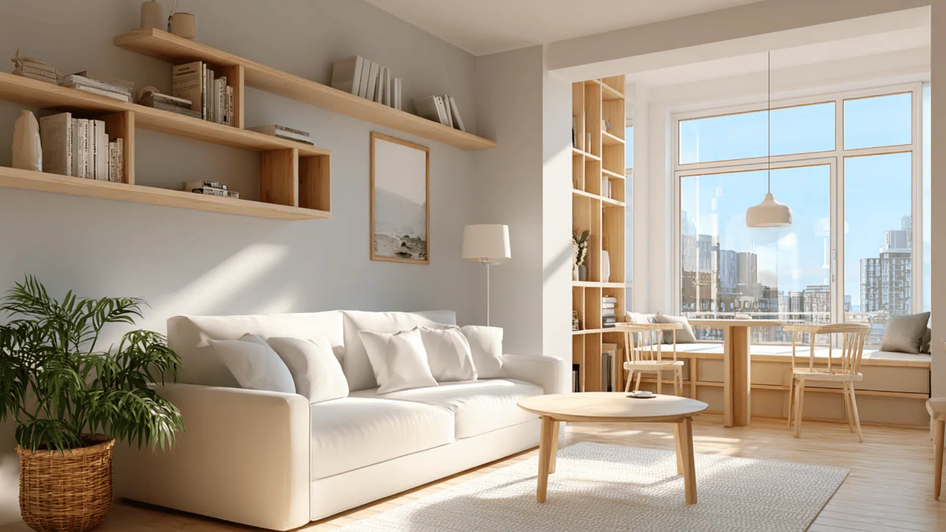
A small room feels larger when your eyes have somewhere to go. A full-height window creates a longer sightline and connects the inside with the outdoors.
Use your longest wall for the biggest glass opening whenever the layout allows. Fixed windows can give you more glass area while keeping the design clean.
Even a small home can feel open when natural views extend into the room rather than stopping at a wall.
7. Design the Bathroom Around One Good Fixture
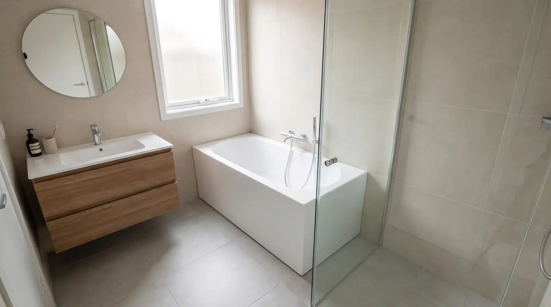
A tiny bathroom does not need every possible feature. Trying to fit too much usually makes everything feel smaller and less comfortable.
Choose one feature you genuinely enjoy, like a deep soaking tub, walk-in shower, or floating vanity. Let that piece become the focus of the room.
Keep the rest simple with fewer finishes and cleaner lines. A bathroom with one great feature often feels more luxurious than one packed with options.
8. Mount Everything that Can Be Mounted
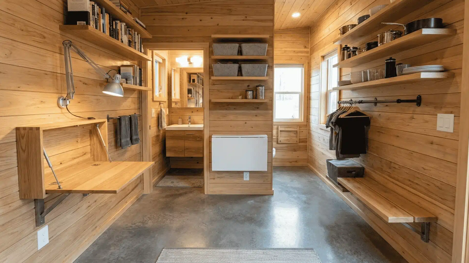
Floor space matters more than people realize in a tiny home. Furniture legs, cabinets, and bulky bases break up the room and make it feel tighter.
Look around and find items that can move upward. Floating shelves, wall-mounted desks, hanging lights, and floating vanities can free up valuable walking space.
Seeing more of the floor creates a more open feeling. Small changes like these can make daily movement much easier.
9. Treat Storage as the Primary Design System
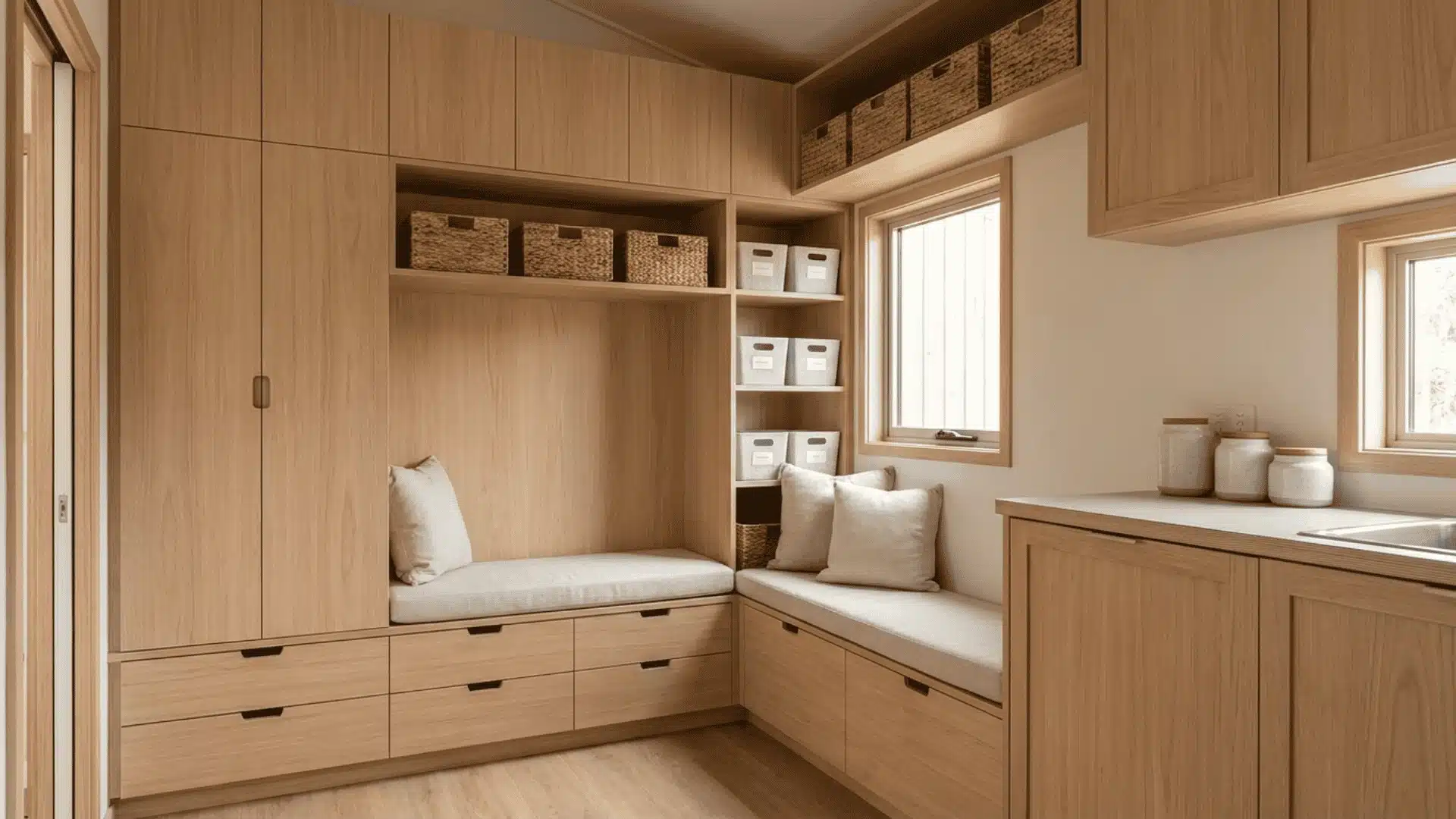
Storage should not be something you add after finishing the design. In a tiny home, it controls how comfortable your everyday life feels.
Before choosing cabinets or finishes, consider what you already own. Where will clothes go? Where will kitchen tools live? Where will cleaning supplies hide?
Design storage around your real habits, not just what looks good in photos. When everything has a place, the home feels calmer.
10. Use a Continuous Flooring Material Throughout

Different flooring materials can create visual stops in a small home. Your eyes notice every change, which can make the space feel divided.
Using one flooring material throughout creates a smoother flow from one area to another. The kitchen, living room, and sleeping zone feel connected.
A continuous floor does not mean the layout feels boring. You can still create zones through furniture, lighting, and small design details.
11. Design the Outdoor Connection Intentionally
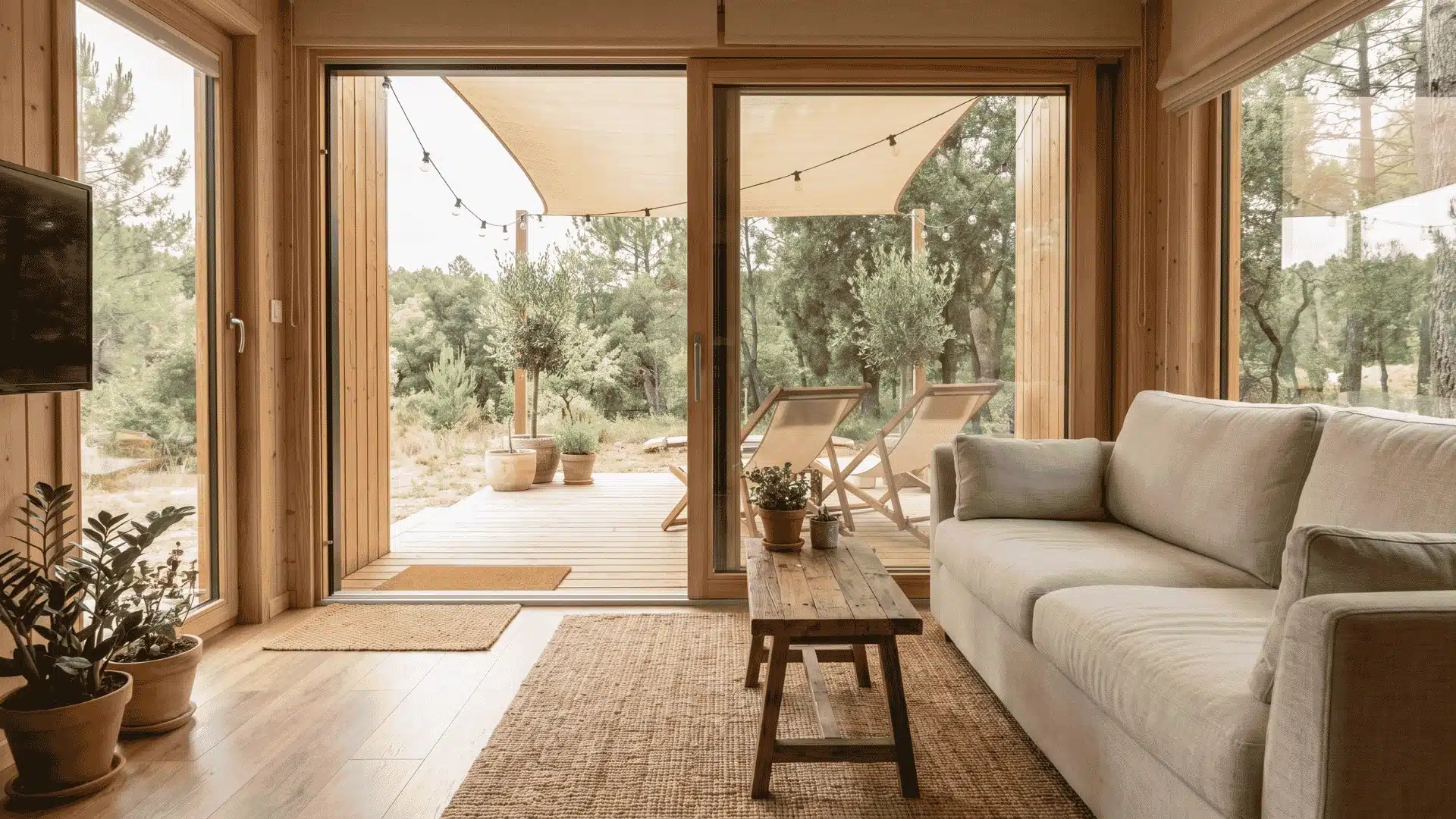
A deck, patio, or porch can make a tiny home feel much larger when it feels like a natural extension of the indoor space.
Place the main living area near the outdoor opening when possible. Large glass doors or wide windows help extend your view and make the boundaries between inside and outside feel less noticeable.
When the transition feels seamless, the outdoor area becomes an extra living space for morning coffee, meals, or relaxing without making the home itself feel crowded.
12. Give the Sleeping Alcove Its Own Micro-Environment
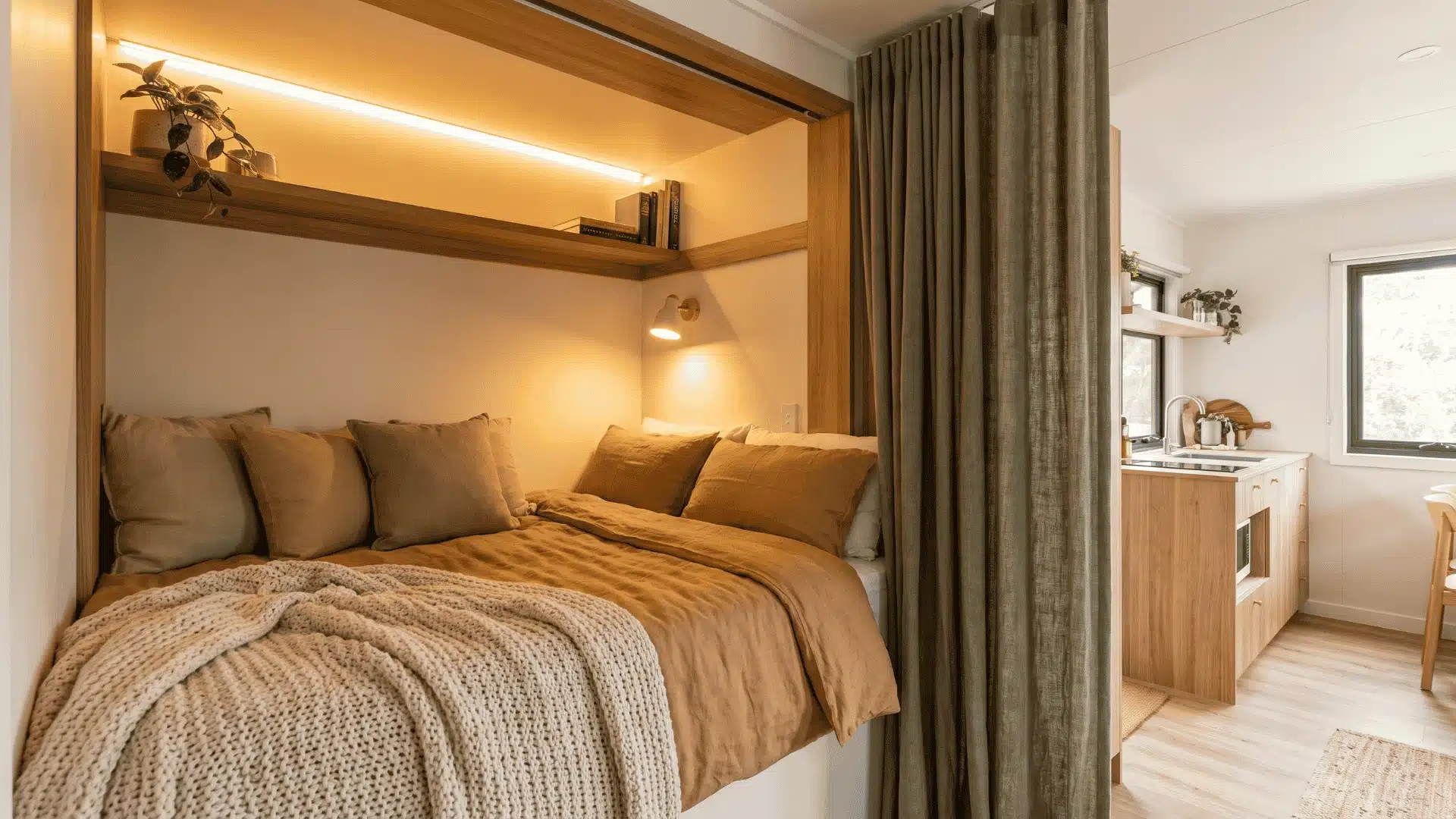
A sleeping area feels more comfortable when it feels separate from the rest of the home. Even without walls, small design choices can create that sense of separation.
I’ve found that simple changes like warmer lighting, softer bedding, curtains, or different textures can make a sleeping zone feel calmer and more intentional.
These details help your brain recognize the space as a place to rest. The rest of the home can then keep a more open and active feel without making the sleeping area feel disconnected.
13. Prioritize Vertical Storage in the Kitchen
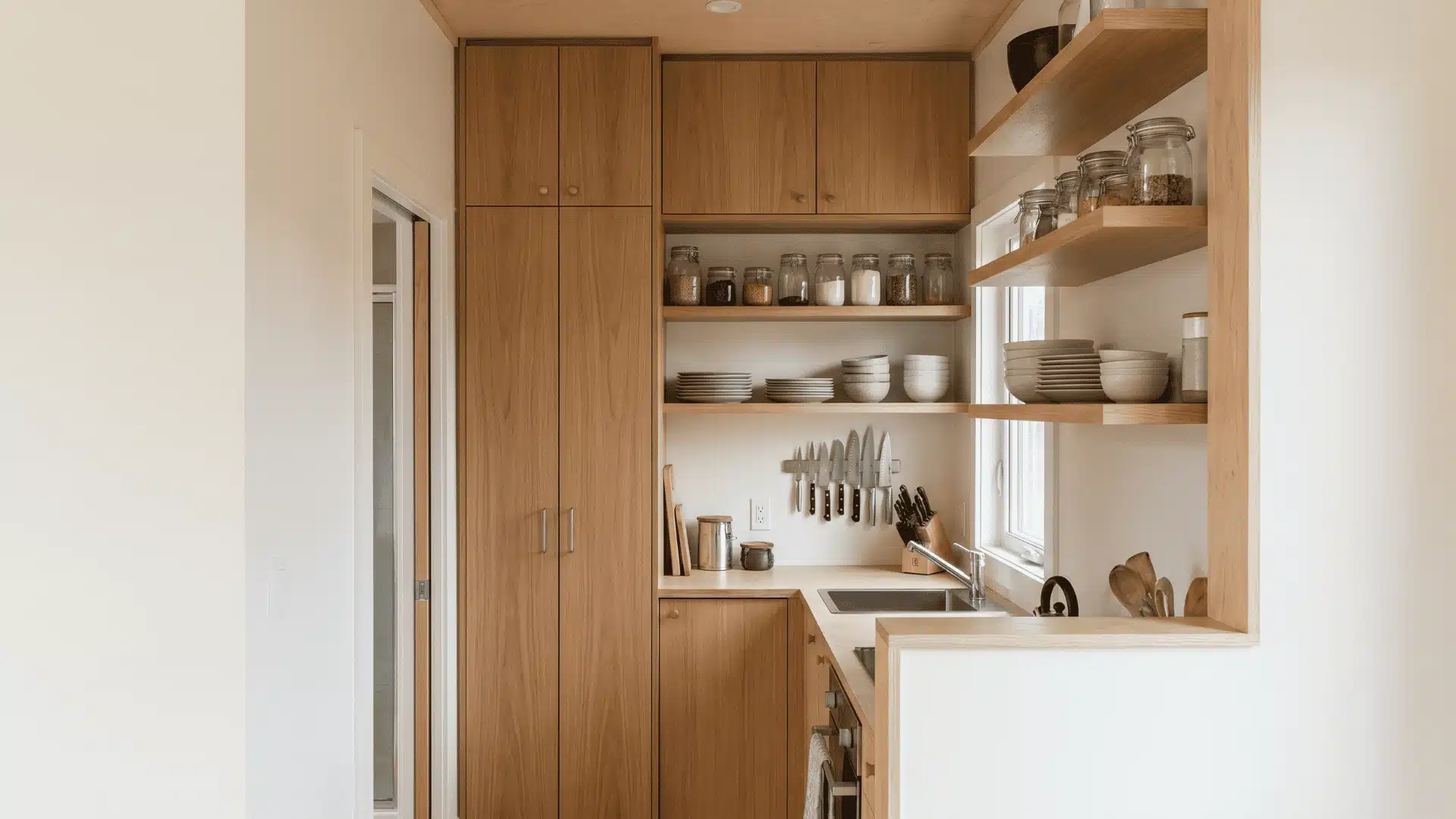
Kitchen counters disappear quickly in tiny homes. Every appliance, container, or utensil left out takes away from the workspace you have available.
Move everyday items upward with tall cabinets, open shelves, magnetic strips, or hanging storage. Using wall space keeps the counters clear instead of letting everything collect around your cooking area.
A clean countertop makes meal prep easier and helps the kitchen feel more organized throughout the day.
14. Use Mirrors as a Structural Tool, Not Decoration
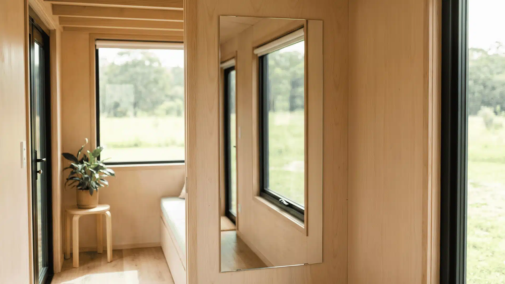
Mirrors can change how a tiny room feels when they are placed with purpose. I’ve seen small spaces feel noticeably larger just by adding one well-positioned mirror instead of filling the walls with decor.
A large mirror can extend a sightline and make a narrow area feel deeper. Placing a full-height mirror across from a window is especially effective because it reflects natural light and outdoor views back into the room.
Avoid adding several small mirrors around the space. Too many frames can make the room feel busy and take away from the open feeling you’re trying to create. One larger mirror usually does more.
15. Edit the Interior Before You Decorate It
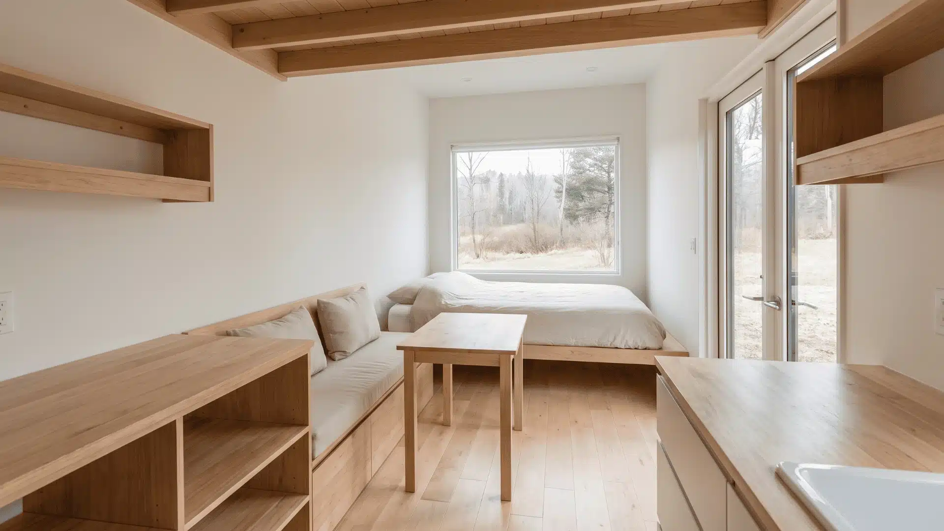
A tiny home does not need more items to feel complete. It usually needs fewer pieces that are useful and fit the space well.
Spend some time living in the home before adding extra decorations. You’ll quickly notice what you use every day and what only takes up valuable space.
Remove things that do not serve a purpose before bringing in something new. A thoughtfully chosen space feels more comfortable, easier to manage, and less crowded.
16. Control Artificial Lighting in Layers
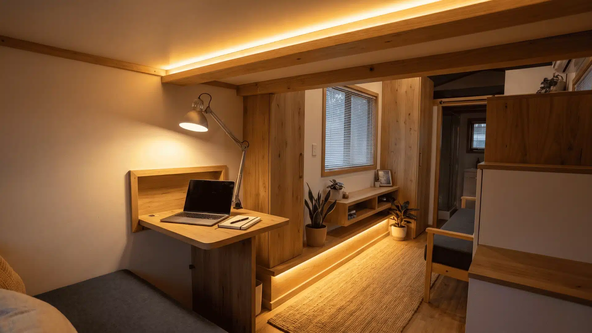
A single ceiling light can make a tiny home feel flat and unfinished. Using different layers of lighting adds depth and helps each area serve a different purpose.
Use overhead lights for general brightness, focused lights near work areas, and softer lamps or fixtures for relaxing spaces.
Being able to change the lighting throughout the day can completely shift how the home feels without changing the layout or adding new decor.
17. Keep the Ceiling a Single Unbroken Finish
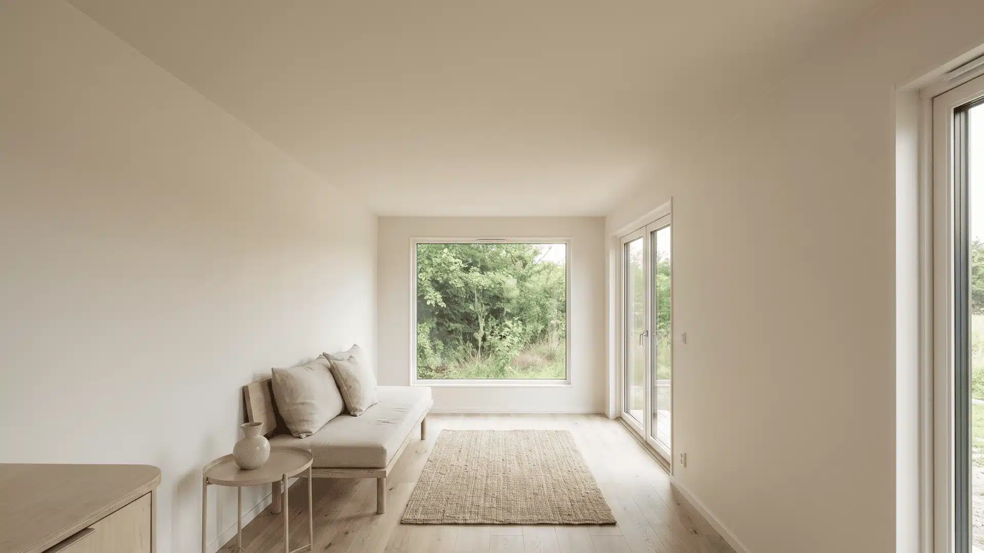
The ceiling takes up a lot of visual space in a tiny home, so extra details can make the room feel lower and more crowded.
Keep the ceiling simple with one finish and a light color. A clean, lighter surface helps it blend into the background and creates the feeling of more height.
A simple ceiling also gives other features, like windows, furniture, and decor, more room to stand out without making the space feel busy.
18. Use Plants as a Spatial Tool, Not Just Decoration
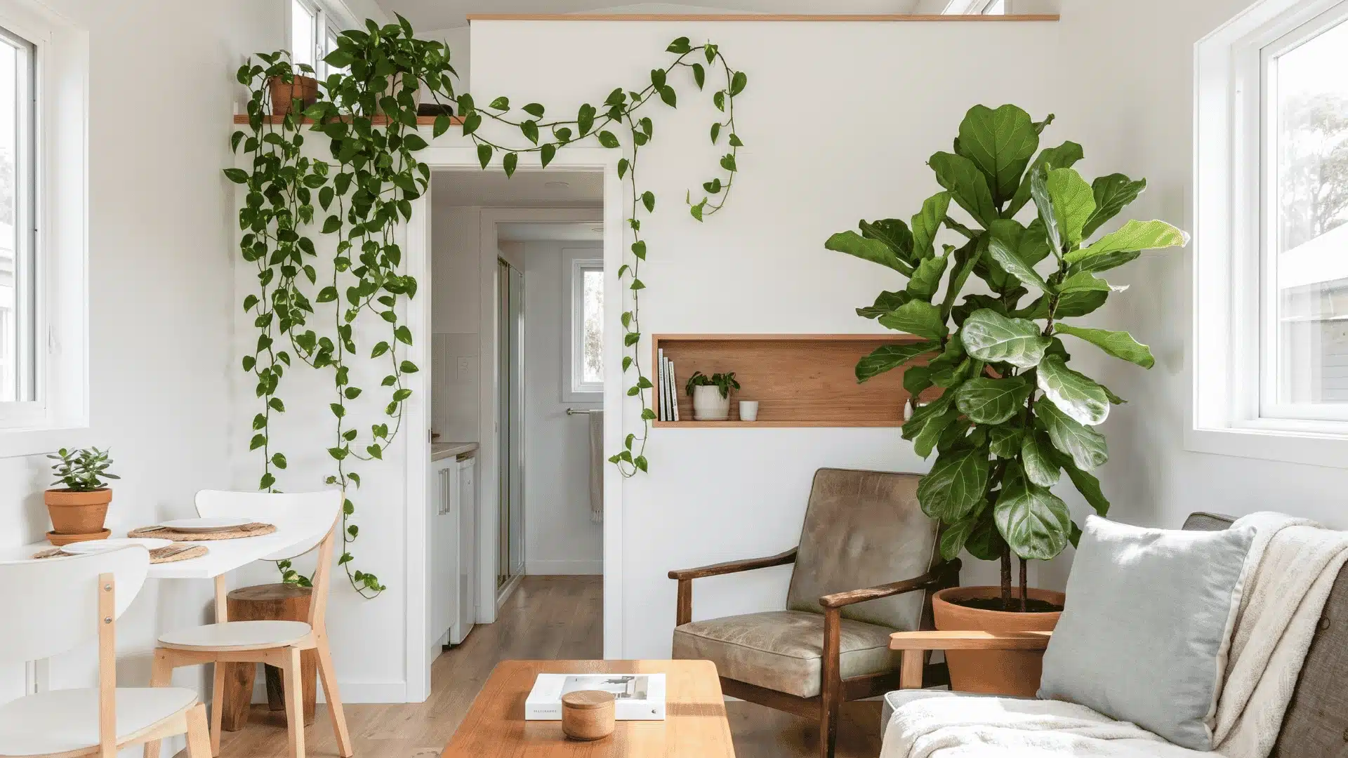
Plants can help separate areas without making a small room feel crowded. A larger plant can act as a natural divider between spaces while keeping the layout open.
Instead of filling every corner with small pots, choose one or two larger plants that make a bigger impact. Too many small plants can make the room feel busy and cluttered.
A tall plant near a window, sofa, or empty corner adds height, brings in natural texture, and makes the space feel warmer without taking up much room.
19. Design Every Transition Point Deliberately
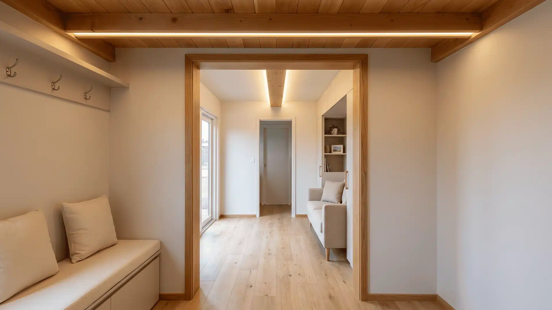
Small homes depend on smooth transitions. The way you move from the entrance to the living area or from the kitchen to the bedroom affects how the whole space feels.
Pay attention to these moments with simple details like matching floors, consistent lighting, or a small change in the ceiling.
When each transition feels planned, the home feels more connected and spacious instead of like a collection of separate areas.
The Role of Light, Color, and Material in a Compressed Space
In a tiny home, light, color, and material don’t function decoratively; they determine the baseline spatial experience before any furniture or storage is introduced.
Get these wrong, and no amount of clever storage will recover the interior. Get them right, and the space feels workable before a single piece of furniture arrives.
Natural Light and Window Placement
Natural light is the most powerful variable in a tiny home interior, and the least controllable after the build is done.
The quantity of light matters, but so does its direction.
- A north-facing window delivers flat, consistent light.
- A south- or west-facing window brings warmth that shifts through the day.
A well-lit tiny home makes every other design choice read as intended. A poorly lit one makes even good decisions look wrong.
Color Palette and Tonal Continuity
A neutral palette works because it reduces the number of tonal transitions your eye tracks across the space; fewer transitions mean less visual effort. Here’s where people go wrong with it:
- Treating neutral as a single color decision rather than a tonal system
- Mixing warm whites with cool whites across different surfaces
- Pairing soft linens with stark cabinet finishes that sit in a different tonal family
When any of these drifts, the eye catches the shift, and the sense of continuity breaks down, even if each individual surface looks fine on its own.
Material and Finish Consistency
Material quality matters far less than you’d expect. What fragments a tiny home interior isn’t cheap material, it’s inconsistent material.
Three different wood tones across flooring, cabinetry, and a feature wall will fragment the space regardless of how good each individual piece is.
The same wood tone used consistently across all three creates flow that reads as spaciousness. Continuity does the work, not quality.
Furniture and Storage as Spatial Logic, Not Just Solutions
In a tiny home interior, furniture and storage decisions are fundamentally spatial decisions; the question isn’t which products to buy, but how each piece affects sightlines, clearance, and visual count.
Every piece of furniture should either do multiple jobs or visually recede into the architecture. If it does neither, it’s adding to the visual count without earning its place.
Built-in vs. Freestanding Storage
Both storage types have their place in a tiny home; the right choice depends entirely on your layout and how much visual weight the space can carry.
| Category | Built-in Storage | Freestanding Storage |
|---|---|---|
| Reads as | Architecture | Object |
| Visual weight | Low | Higher |
| Best layout | Partitioned or smaller plans | Open-zone plans |
| Floor impact | Minimal | Takes up floor area |
| Sightline effect | Recedes into walls | Can crowd sightlines |
| Flexibility | Fixed | Moveable |
In a compressed space, the distinction matters more than most people expect. Default to built-ins when in doubt; they recover wall space without adding to the visual count.
Multifunctional Furniture and Where It Works
Multifunctional furniture reduces the number of distinct pieces the eye counts; a storage bench instead of a bench and a cabinet is one object, not two.
The mistake is assuming it works everywhere. In a heavily partitioned plan, a fold-out sofa bed or extendable dining table can create more disruption than it solves.
Evaluate each piece by what it costs in clearance and floor area when in use, not just when stored. That’s where the real spatial trade-off lives.
Vertical Space and Overhead Storage
Floor area is the scarcest resource in a tiny home. Vertical space is almost always underused, especially above eye level and over doorways.
Shelving that runs to the ceiling, overhead cabinet runs, and loft storage all reclaim space the floor plan doesn’t give you.
The trade-off is accessibility. Store rarely used items overhead and keep daily-use items within easy reach.
Wrapping Up
A well-designed interior tiny home isn’t the result of finding the right products or copying a floor plan that looked good online. It’s the result of understanding that every decision, light, material, layout, and storage feeds into every other one.
The square footage ceases to be the constraint when the spatial logic is right. Start with your floor plan, lock in your light and material system, and edit ruthlessly before you decorate.
The interior tiny homes that feel genuinely livable aren’t the ones that added more; they’re the ones that committed to less, on purpose.
If you’re ready to plan your tiny home interior, start with the floor plan section above and work forward from there.
Frequently Asked Questions
What do tiny home interiors typically look like?
Most tiny home interiors prioritize open sightlines, neutral or monochromatic palettes, and built-in or multifunctional furniture. They tend to feel more architectural than conventionally decorated, surfaces do double duty as storage or structure, and material choices are kept consistent throughout to prevent visual fragmentation in a compressed footprint.
What’s the biggest interior design mistake in tiny homes?
Treating a tiny home like a miniature version of a regular home and trying to include every room type at a smaller scale. The more effective approach is to design around how you actually use a space each day and to eliminate zones you’d use rarely, which allows the spaces you do use to function at full quality.
Do tiny home interiors work for families or only for solo living?
They can work for families, but the interior logic shifts significantly. Family-oriented tiny homes require clearly delineated private zones, typically a partitioned sleeping area rather than an open loft, and more aggressive built-in storage to maintain clear circulation. Extra-wide models (10–12 ft) make this substantially more achievable.
Is a no-loft tiny home interior more livable than a loft design?
For accessibility and daily ease, generally yes, no-loft designs maintain full ceiling height throughout and eliminate stair or ladder navigation. The trade-off is a smaller overall footprint or a longer overall structure to recover the sleeping area. Which is more livable depends on the occupants’ physical needs and the amount of floor area they can accommodate.