A home is never experienced by sight alone. We notice the coolness of a stone worktop, the softness of fabric beneath our fingertips, the brightness of morning sun and the way a paint colour changes after dark.
These sensory cues help create the atmosphere of a room. Research into touch, light and colour suggests that our surroundings can influence comfort, alertness, emotion and perception. That doesn’t mean there is a scientifically perfect bedroom colour or a particular fabric guaranteed to make everyone relax. Human responses vary with context, culture, memory and personal preference.
A more useful approach is to consider how a room feels to live in, not simply how it looks.
Start With Texture: The Part of a Room You Can Feel
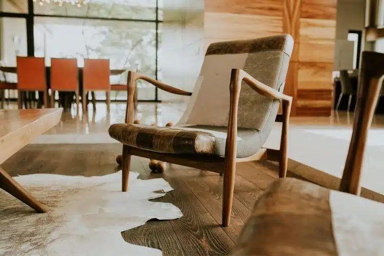
Texture gives an interior physical character. Smooth timber, crisp cotton, brushed metal, woven wool and glazed ceramic create noticeably different sensations. Even before touching a surface, we often form expectations about how it will feel.
Faucheu et al. (2019) investigated how people responded to specially produced tactile surfaces. They found that physical characteristics influenced how pleasant participants found the surfaces to touch. The study examined controlled stimuli rather than complete interiors, so it would be misleading to claim that a certain furnishing can automatically alter someone’s mood. What it does show is that our response to texture has an emotional dimension.
At home, contrast is worth considering. A room dominated by hard, smooth finishes can feel very different from one containing a mixture of tactile surfaces. In a hallway, for instance, a rug adds another texture beneath the feet while introducing pattern or colour into a narrow space. Pieces such as runner rugs by Double Studio can sit alongside timber, tiles and painted surfaces as one element within that wider sensory scheme.
Touch can easily be overlooked when interiors are judged primarily through photographs. Spence (2020) argues for a multisensory approach to architecture that considers touch alongside sight, sound and smell. Quoting Finnish architect Juhani Pallasmaa, he captures the idea neatly: “The door handle is the handshake of the building” (Pallasmaa, 1994, p. 33, as cited in Spence, 2020).
Let Light Follow the Rhythm of the Day

Light does more than help us see. It also provides an environmental cue to the human circadian system, which regulates daily patterns including sleep and wakefulness.
Tähkämö et al. (2019) reviewed 128 studies examining the relationship between light exposure and circadian rhythm. Their review found that the timing and characteristics of light exposure matter, with exposure in the morning, evening and at night capable of affecting circadian timing. The researchers also highlighted considerable differences in study methods and participant groups.
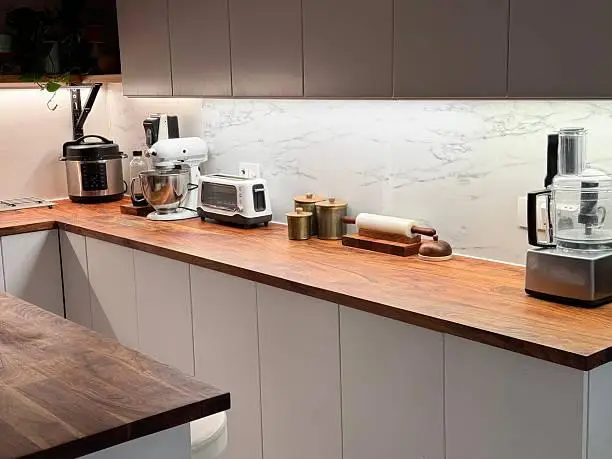
This makes blanket rules about “good” and “bad” lighting unhelpful. A brightly illuminated kitchen may work well while preparing food, while a lower level of light might feel more comfortable when relaxing later.
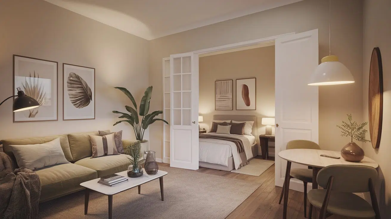
Layered lighting gives a room greater flexibility. General lighting provides overall visibility, task lighting supports activities such as reading or cooking, and smaller lamps can create a gentler atmosphere when strong illumination is unnecessary.
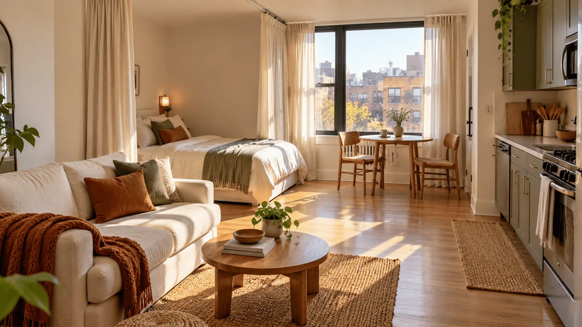
Daylight deserves consideration too. Curtains, blinds and furniture placement all affect how natural light reaches the places where you sit, work or relax. Instead of selecting a light fitting solely for its appearance, think about when and how the room is used.
Treat Colour as Context, Not a Prescription
Colour psychology is often reduced to simple formulas: blue is calming, red is stimulating and green is restful. Research paints a more complicated picture.
Jonauskaite et al. (2020) studied colour-emotion associations among 4,598 people from 30 nations who spoke 22 native languages. They identified strong shared patterns but also differences associated with linguistic and geographic proximity. Some colour-emotion associations therefore appear widely shared, while culture and context continue to play a role.
For decorating, this is a good reason to avoid treating colour advice as a set of universal rules. Instead of asking which shade is supposed to be relaxing, consider the colours you personally associate with rest, concentration, sociability or warmth.
The surrounding environment matters as well. Paint seen in bright daylight can look noticeably different under an electric lamp in the evening. Test samples in the actual room and look at them at several times of day before making a decision.
Proportion changes the effect too. A strong colour doesn’t need to cover every wall. Ochre, cobalt, forest green or burgundy can appear in smaller areas through upholstery, artwork, ceramics or textiles.
Design the Senses Together
Texture, light and colour rarely work independently. Much of a room’s character comes from their interaction.
Consider a reading corner. Comfortable fabric, natural light during the day, a well-positioned lamp in the evening and a restrained colour palette can help define it as somewhere to settle. Harsh overhead light or a highly reflective surface could make the same area feel quite different.
Rooms also have different sensory demands. Kitchens need clear visibility and practical surfaces. Bedrooms benefit from greater control over light. Hallways act as transitions between spaces, giving texture and colour a role in connecting neighbouring rooms.
Personal preferences matter just as much. Culture, age, sensory sensitivity and individual experience can influence how an interior feels. A pattern one person finds lively may seem distracting to someone else. Designing around the people who actually use the space is more useful than following a supposedly universal formula.
Make Small Changes Before Redesigning Everything
Thinking sensorially doesn’t require a complete renovation. Start with a room that feels uncomfortable, stark or overly busy and look at its individual elements.
Are nearly all the surfaces hard and glossy? Does every light come from the ceiling? Is there so much visual contrast that your eye has nowhere to rest? Or does the space feel flat because most finishes share the same texture and tone?
Change one layer at a time. Move a lamp before replacing it. Introduce a textile before buying new furniture. Leave a paint sample on the wall for several days before committing to the whole room.
Small changes make it easier to work out what the space actually needs.
Conclusion
A home that feels good isn’t created by following a perfect palette or copying a list of wellness trends. It starts with paying attention to the sensory details of everyday life.
Texture shapes our physical experience of a room. Light supports practical activities while interacting with daily rhythms. Colour carries emotional associations, but those associations also depend on culture, context and the individual.
Instead of asking only, “Does this look good?”, notice what happens when you spend time in the room. Where does your eye rest? What do your hands and feet touch? How does the light change from morning to evening?
A sensory home starts with those observations. Even modest changes can then make a space feel more considered, comfortable and suited to the way you live.
References
Faucheu, J., Weiland, B., Juganaru-Mathieu, M., Witt, A., & Cornuault, P.-H. (2019). Tactile aesthetics: Textures that we like or hate to touch. Acta Psychologica, 201, 102950. https://doi.org/10.1016/j.actpsy.2019.102950
Jonauskaite, D., Abu-Akel, A., Dael, N., Oberfeld, D., Abdel-Khalek, A. M., Al-Rasheed, A. S., Antonietti, J.-P., Bogushevskaya, V., Chamseddine, A., Chkonia, E., Corona, V., Fonseca-Pedrero, E., Griber, Y. A., Grimshaw, G., Hasan, A. A., Havelka, J., Hirnstein, M., Karlsson, B. S. A., Laurent, E., . . . Mohr, C. (2020). Universal patterns in color-emotion associations are further shaped by linguistic and geographic proximity. Psychological Science, 31(10), 1245–1260. https://doi.org/10.1177/0956797620948810
Spence, C. (2020). Senses of place: Architectural design for the multisensory mind. Cognitive Research: Principles and Implications, 5, Article 46. https://doi.org/10.1186/s41235-020-00243-4
Tähkämö, L., Partonen, T., & Pesonen, A.-K. (2019). Systematic review of light exposure impact on human circadian rhythm. Chronobiology International, 36(2), 151–170. https://doi.org/10.1080/07420528.2018.1527773