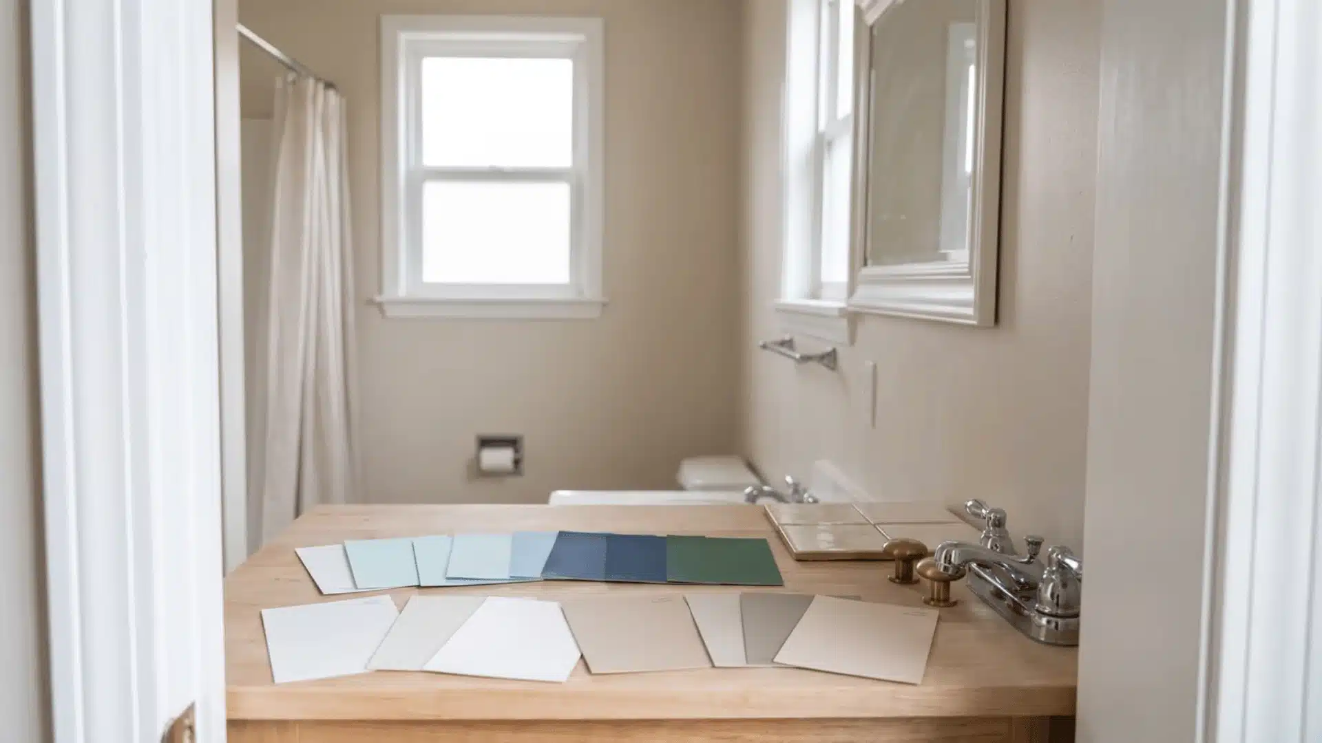
A small bathroom can feel cramped even when every fixture is exactly where it needs to be. The right paint can change that feeling without moving a single wall. Layout choices matter here too, even space-saving shower layout can free up visual space that paint alone can’t create.
I’ve found that the best small bathroom paint colors depend on more than personal taste. Natural light, fixture finishes, tile, and the mood you want all affect how a shade looks once it reaches the walls.
You’ll see options ranging from warm whites and soft neutrals to muted greens and deeper, dramatic shades.
I’ll also cover how paint can make a bathroom feel larger, how to match colors with existing finishes, and what works best when there is little or no natural light.
What Paint Colors Make a Small Bathroom Look Bigger?
Whether you land on a light color or a dark one, the mechanism that actually makes the room feel bigger has less to do with light versus dark, and more to do with edges.
Light colors like Alabaster and Chantilly Lace work by reflecting light rather than erasing anything. Pale walls bounce available light around the room, which is why they read as open; more reflected light means fewer shadows, and fewer shadows means the room feels less boxed in.
Cooler whites and pale blues do this in a crisp way that holds up even on an overcast day; warmer whites and soft beiges do it more gently, opening the room up without a clinical feel.
Dark colors like Black Forest Green and Black Magic work differently. When wall, trim, and ceiling share one shade, the eye can’t find where one surface ends and another begins, and that loss of visible edges is what tricks the eye into reading the room as bigger.
Two conditions matter here: contrast trim undoes the effect immediately, since a crisp white trim line against a dark wall draws the small footprint right back into view, and low ambient light works against it too, since a dark room with nothing to bounce light off can feel cramped instead of cozy.
Ventilation habits play into this as well, the same small bathroom moisture control practices that keep a tight bathroom healthy also keep painted surfaces looking their best over time/
So the real question isn’t light or dark. It’s whether your bathroom has enough light to support going dark, and whether you’re willing to skip the contrasting trim.
Small Bathroom Paint Colors for Every Style and Space
The right small bathroom paint color depends on three things that have nothing to do with which shade you like best: how much natural light the room gets, what your fixtures already look like, and whether you want the space to feel open or intentional.
Below are twelve colors I’ve tested or specified in real small bathrooms, organized by the effect each one actually produces on the wall, not just how it photographs on a swatch.
These popular tiny bathroom color schemes range from bright whites and soft neutrals to muted greens and deeper shades, giving you options for both airy and cozy spaces.
1. Sherwin-Williams Alabaster (SW 7008)
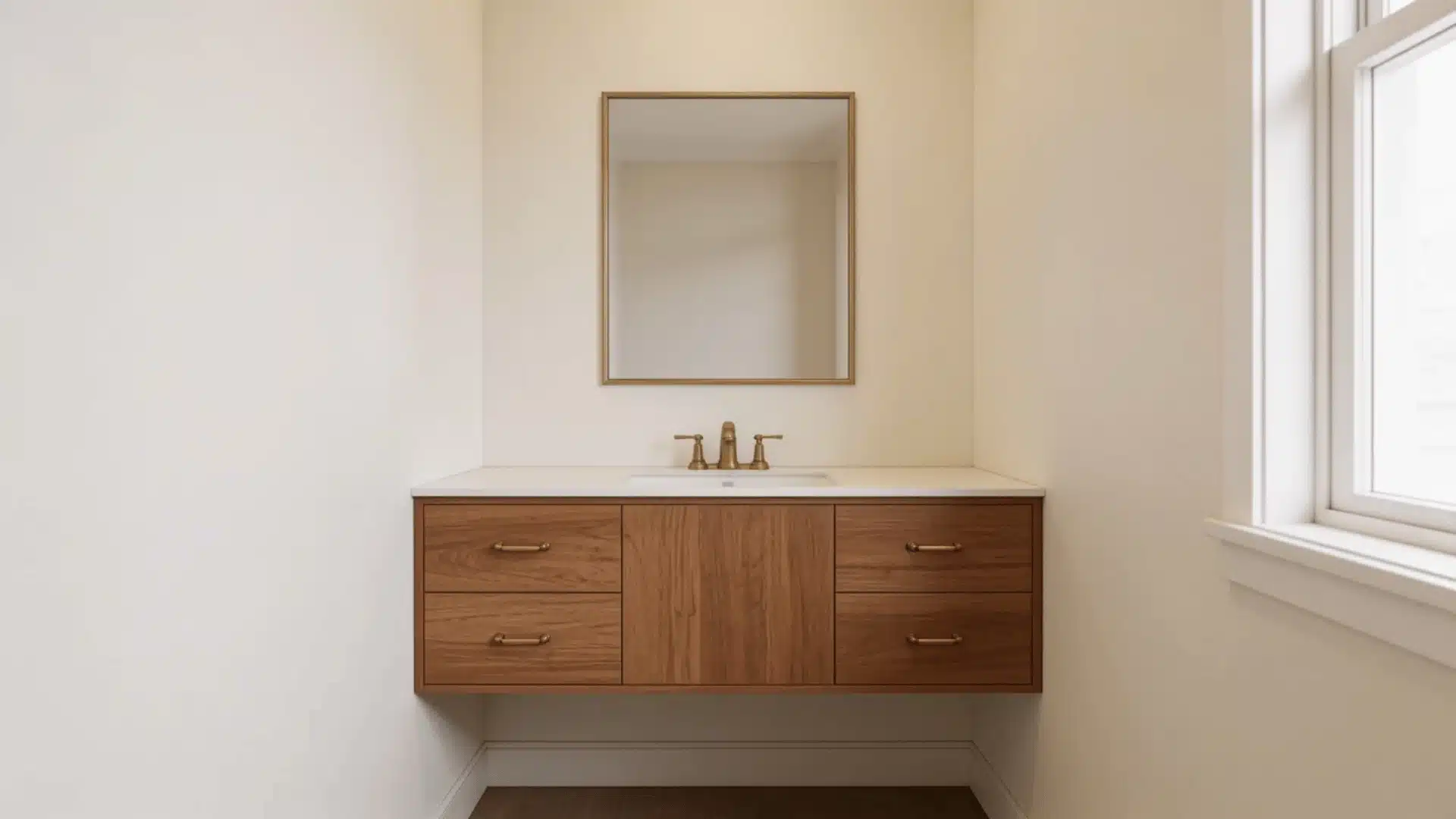
Alabaster reads as a warm off-white rather than a stark one, and its high LRV means it bounces most of the light hitting the wall right back into the room. That’s the mechanism that makes it feel bigger, not just brighter.
The faint yellow undertone keeps it from feeling clinical, which is why it pairs so easily with warm wood vanities and brass fixtures.
Used on all four walls in a windowless powder room, it stays warm rather than shifting muddy, which is more than most whites can say. It’s a light-and-airy pick, and it’s been Sherwin-Williams’ Color of the Year once for good reason; it’s a workhorse in small spaces.
| Color Name | Alabaster, SW 7008 |
| Brand | Sherwin-Williams |
| LRV | 82, light |
| Undertones | Warm, soft yellow |
| Best For | Rooms with brass or warm wood, limited daylight |
| Avoid In | Bathrooms with cool chrome and gray tile; the yellow cast will fight the finishes |
2. Benjamin Moore Chantilly Lace (OC-65)
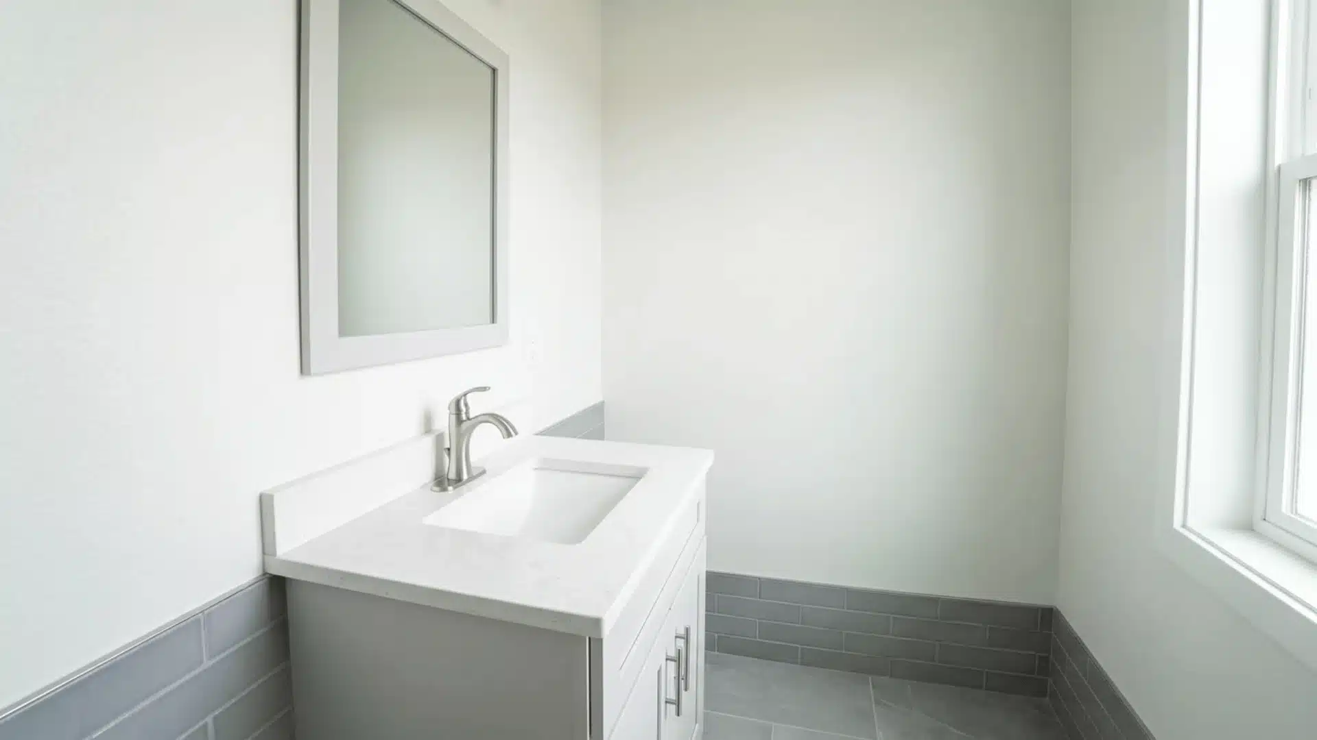
Chantilly Lace sits near the top of the LRV scale, which is why designers reach for it in bathrooms that are fighting for light.
Where Alabaster carries warmth, this one leans cool, and it shows up cleanest under strong daylight, where the faint green undertone reads crisp instead of flat. It’s one of the few whites that stays true to itself under different bulbs, which matters more than people expect once the sample is actually on the wall.
Chrome fixtures and gray tile disappear into it rather than fighting it, and because it reflects so much light, it’s a strong pick if the goal is making the room feel larger rather than moodier.
| Color Name | Chantilly Lace, OC-65 |
| Brand | Benjamin Moore |
| LRV | 90.04, very light |
| Undertones | Cool, barely-there green-gray |
| Best For | Bathrooms with strong daylight and chrome or gray-tone finishes |
| Avoid In | North-facing rooms with weak light; it can read flat instead of crisp |
3. Behr Ultra Pure White (1850)
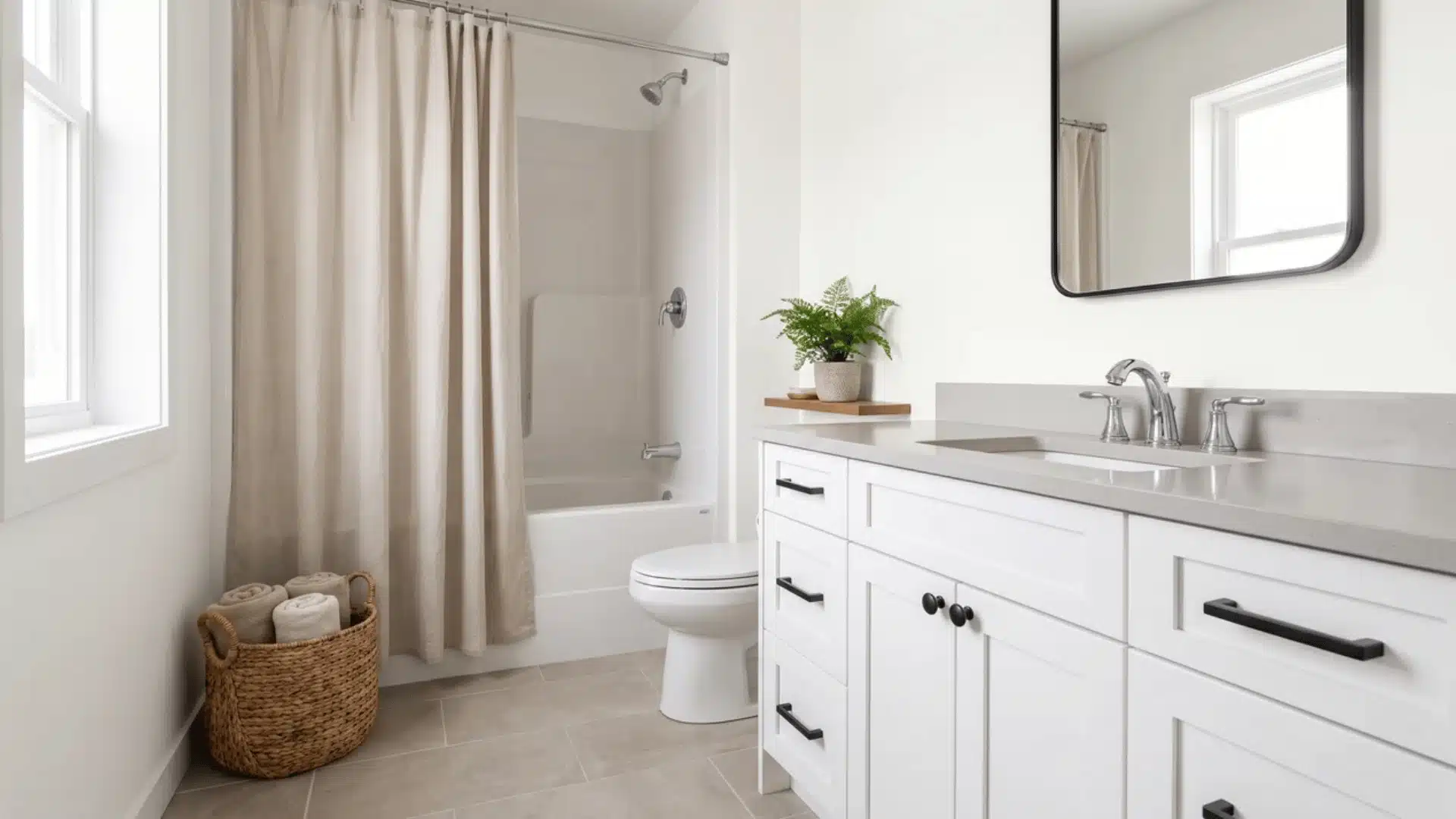
Ultra Pure White reflects nearly all the light that hits it, which makes it one of the most effective choices for a bathroom that’s genuinely starved for daylight.
Its neutral base is the real differentiator here; it won’t shift warm next to brass or cool next to chrome, so it’s a safe pairing with almost any existing finish.
That same neutrality is also its limitation: in a room that only gets weak artificial light, it can look slightly flat rather than bright. This one earns its keep in bathrooms that already get a decent amount of daylight, bringing its brightness forward.
| Color Name | Ultra Pure White, 1850 |
| Brand | Behr |
| LRV | 94 — near-maximum |
| Undertones | Neutral — no warm or cool cast |
| Best For | Mixed-metal fixtures, any tile undertone, daylight-heavy rooms |
| Avoid In | Bathrooms lit only by weak artificial bulbs — it can read flat without daylight to activate it |
4. Behr Swiss Coffee (12)
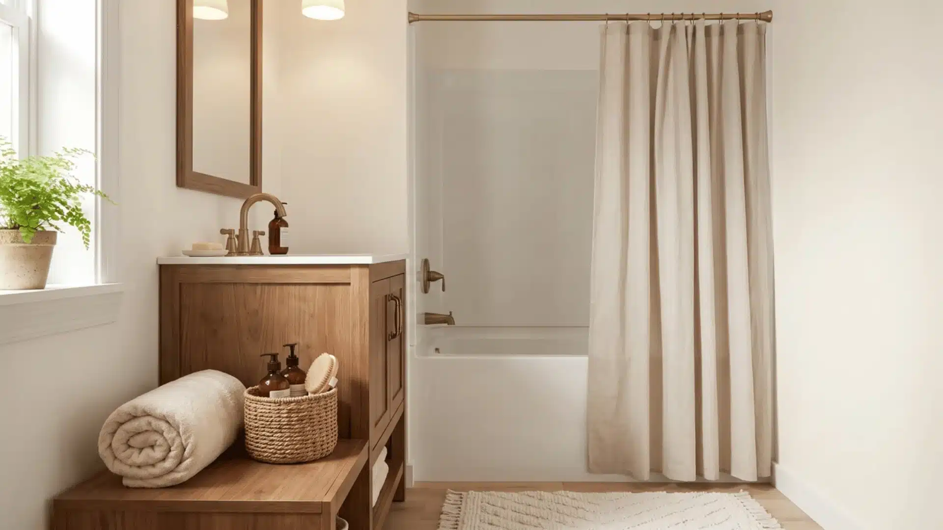
Swiss Coffee lands between a true white and a warm off-white, bright enough to open up a small bathroom without the sharpness of a pure white.
The warmth here is closer to a whisper of cream than a full beige, which is exactly why it’s forgiving under mixed lighting — it doesn’t lurch warm the way a starker white can under yellow bulbs.
Against wood vanities or warm metal fixtures, it doesn’t compete with the existing warmth in the room; it just supports it. This is a light-and-airy color that still reads soft rather than clinical.
| Color Name | Swiss Coffee, 12 |
| Brand | Behr |
| LRV | 84, light |
| Undertones | Soft warm, faint cream |
| Best For | Mixed lighting, wood tones, warm metal fixtures |
| Avoid In | Rooms aiming for a stark, gallery-white look |
5. PPG Breezeway (PPG 11-21)
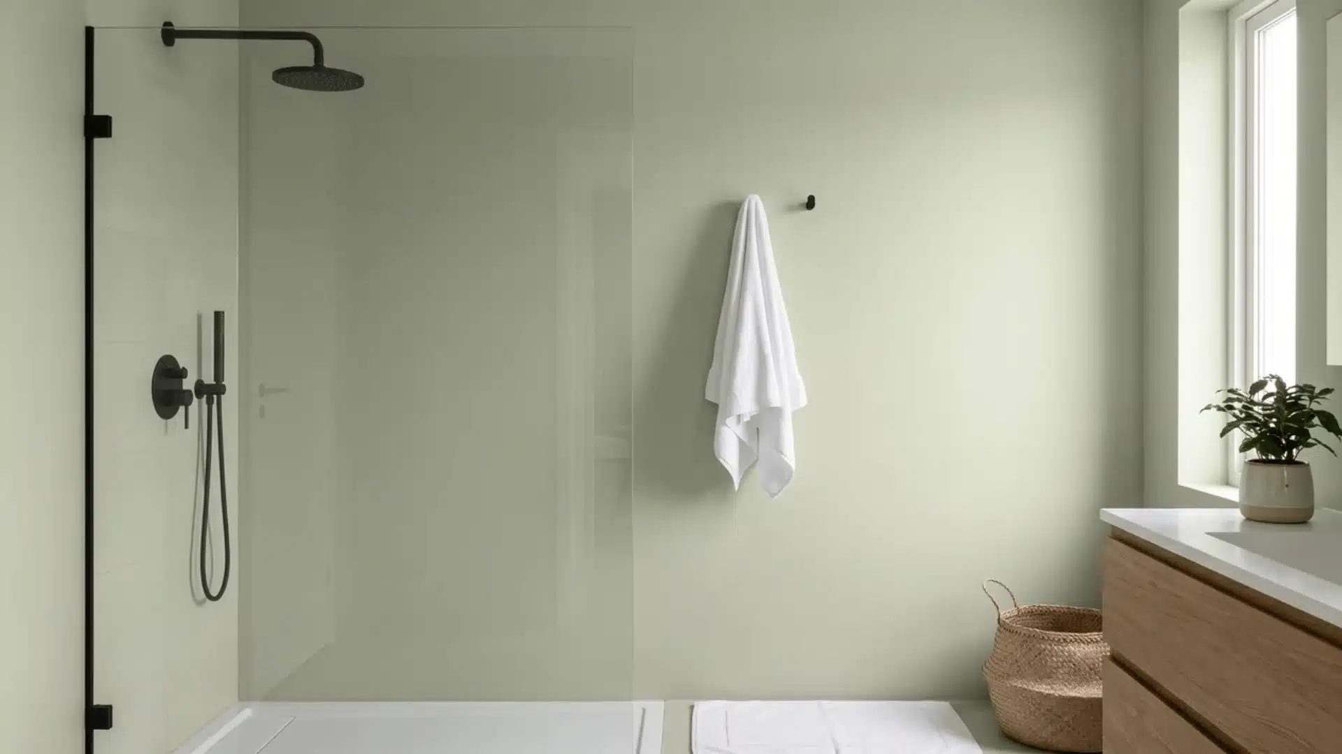
Breezeway sits on the light end of the green family, closer to sage than to a saturated green, and its mid-high LRV keeps it from feeling heavy despite carrying actual color.
The cool, slightly gray undertone gives it a washed-out, calming look rather than a bold one, which is why it reads as soothing even in an enclosed layout.
Brass or matte black hardware pulls the warmth out from underneath the cool base, and natural light brings the green forward while dim light mutes it closer to gray.
This kind of muted, nature-leaning palette tracks with the 2026 remodeling color trends showing up in kitchens and baths alike, where soft greens and earthy tones are edging out cooler grays. This is a warm-neutral-adjacent pick for someone who wants a hint of color without full commitment.
| Color Name | Breezeway, PPG 11-21 |
| Brand | PPG |
| LRV | 69, medium-light |
| Undertones | Cool, muted sage-gray |
| Best For | Brass or matte black hardware, rooms with real daylight |
| Avoid In | Windowless bathrooms under warm LEDs; the cool base can look muddy or green-gray |
6. Benjamin Moore Black Forest Green (HC-187)
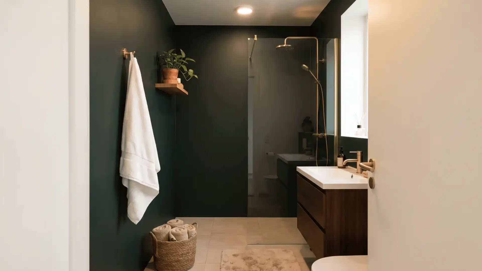
Black Forest Green sits close enough to black that the green only reads clearly under strong light, and that low LRV means it absorbs almost everything hitting it instead of bouncing it back. This is a full-commitment color, not a subtle accent, and it works the way matte black does, by erasing the corners where one wall meets the next.
That’s the trick that makes a small, dark bathroom feel bigger rather than smaller: skip the contrasting white trim, carry the color across walls and ceiling, and let the eye lose track of where the room actually ends. Brass hardware stands out sharply against it, which is the whole point.
| Color Name | Black Forest Green, HC-187 |
| Brand | Benjamin Moore |
| LRV | 4.85, very dark |
| Undertones | Deep, blackened green |
| Best For | Full-wall, trim, and ceiling treatment with brass hardware and strong ambient light |
| Avoid In | Dim rooms, or paired with contrasting white trim if the goal is a larger-feeling room |
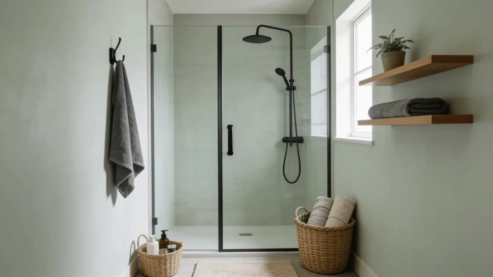
7. Sherwin-Williams Window Pane (SW 6210)
| Color Name | Window Pane, SW 6210 |
| Brand | Sherwin-Williams |
| LRV | 72, light |
| Undertones | Cool, pale gray-green |
| Best For | Chrome or nickel fixtures, rooms wanting subtle color over stark white |
| Avoid In | Rooms with strong brass and warm wood; the cool cast can feel disconnected |
Window Pane is pale enough to still reflect a good amount of light, but with a soft cast of color instead of reading as pure white.
Sherwin-Williams files it under blue, though in most rooms it leans closer to a whisper of gray-green. That subtlety is the appeal; it brings personality into a small bathroom without the commitment of a bolder blue or sage, and its high LRV means it still does the work of opening the room up.
It holds its tone under both daylight and warm bulb light, which is rarer than it should be at this price point.
8. Behr Courtyard Blue (BXC-48)
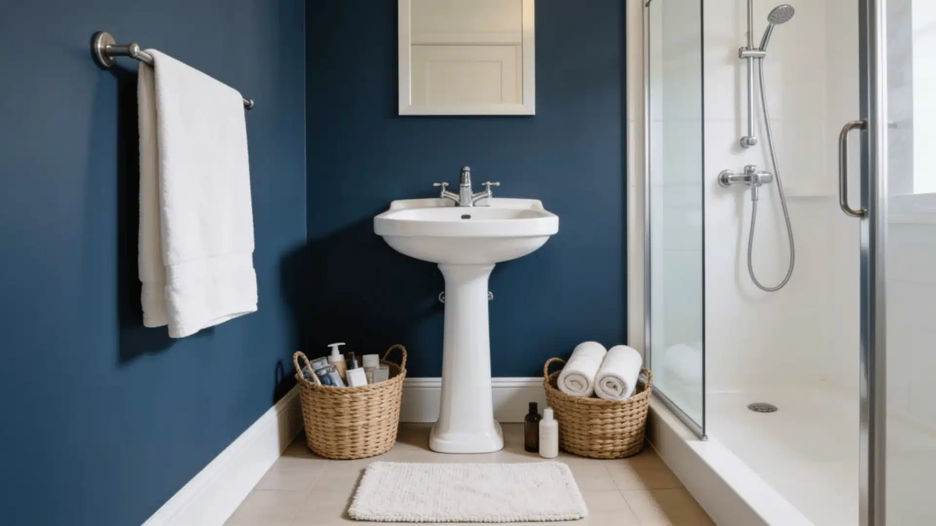
Courtyard Blue is much darker than Window Pane, closer to a muted teal than a soft pastel, and its low LRV gives the room genuine depth instead of the flatness a pastel can produce.
It’s the deeper end of blue for someone who wants color without going all the way to navy or black, and the grayed-down quality keeps it from feeling too saturated in a tight footprint.
White fixtures and chrome hardware stand out clearly against it, and strong ambient light is what keeps it from tipping into looking merely dark rather than intentionally moody.
| Color Name | Courtyard Blue, BXC-48 |
| Brand | Behr |
| LRV | 21, medium-dark |
| Undertones | Cool, dusty blue-teal |
| Best For | White fixtures, chrome hardware, rooms with strong ambient light |
| Avoid In | Dim bathrooms; it can read too dark or heavy without help from lighting |
9. Sherwin-Williams Ancient Marble (SW 6162)
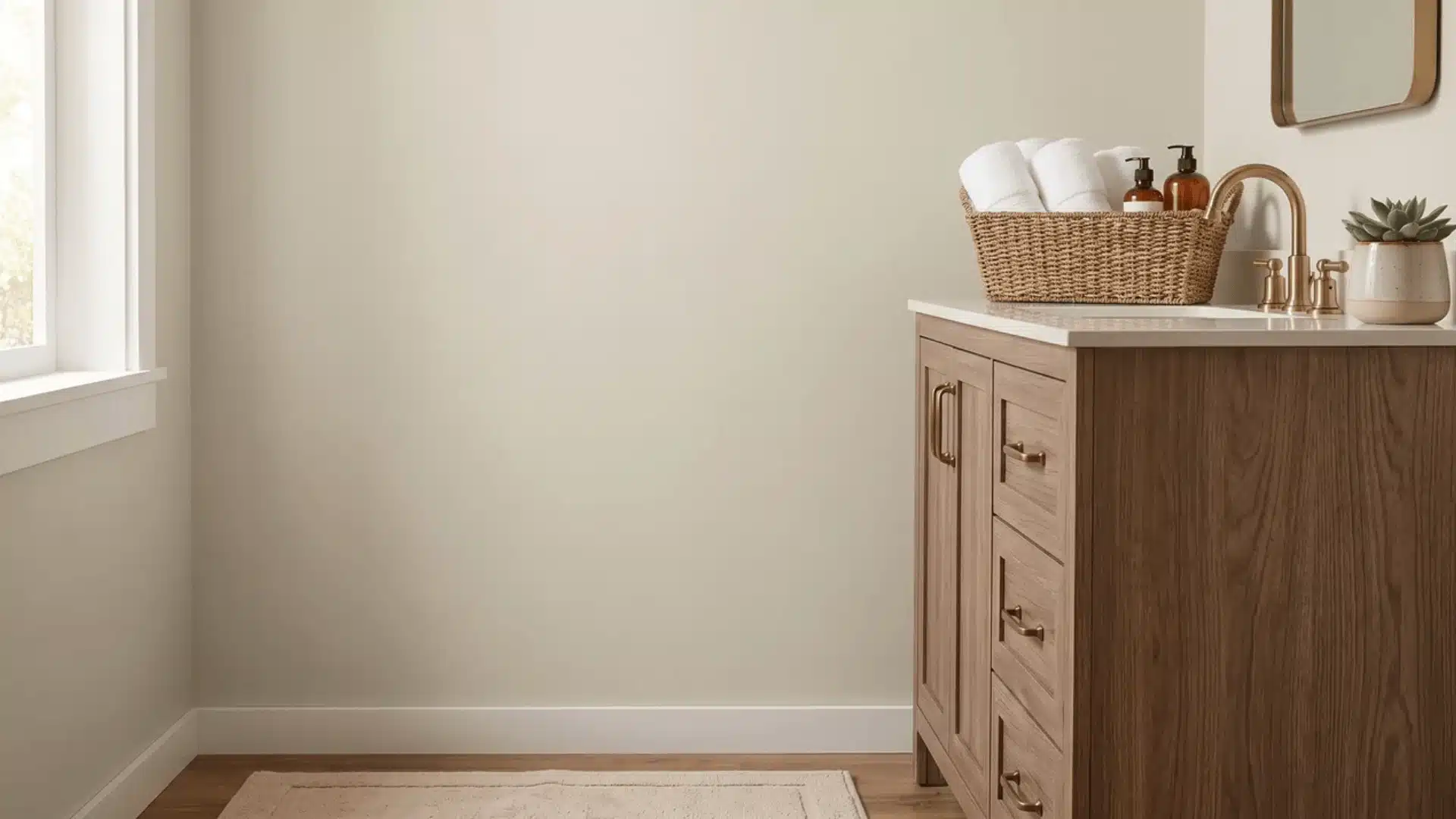
Ancient Marble is a genuine greige, with enough warmth to soften the room without tipping into full beige, and a mid-range LRV that keeps it from reading as either bright or dim.
It’s the middle ground for someone who wants more warmth than white but isn’t ready to commit to a bolder color, and it stays quiet enough to let fixtures and tile do the talking.
Wood vanities and warm metal hardware sit comfortably against it. Under yellow-toned bulbs, it shifts subtly warmer, and under daylight, it settles closer to gray.
| Color Name | Ancient Marble, SW 6162 |
| Brand | Sherwin-Williams |
| LRV | 60, medium |
| Undertones | Neutral, soft warm greige |
| Best For | Wood vanities, warm metal hardware, transitional style |
| Avoid In | Cool-daylight rooms wanting a true gray |
10. Behr Sierra Sand (UL170-20)
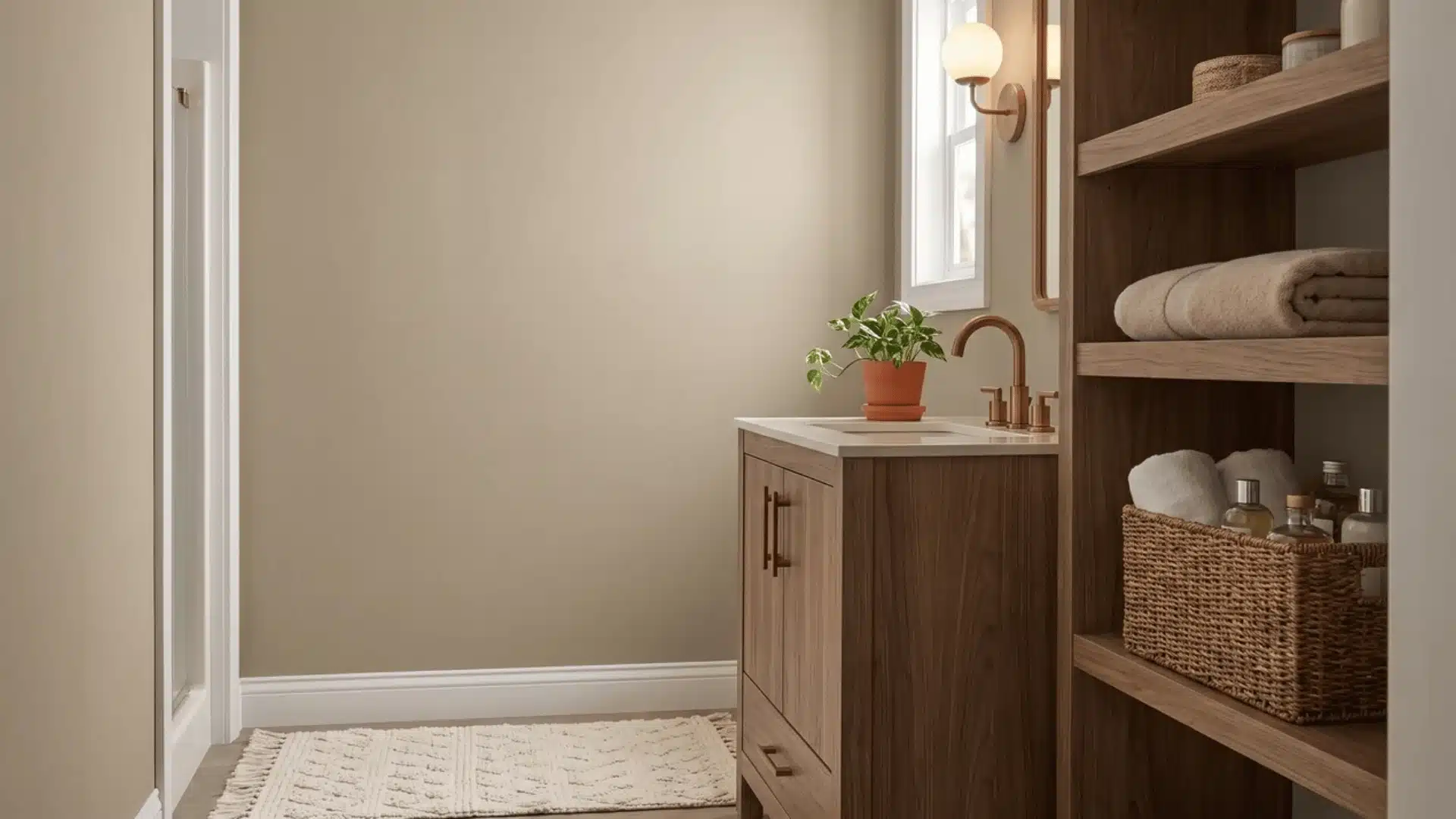
Sierra Sand goes deeper into tan territory than Ancient Marble, with a warmer, more grounded feel. Its lower LRV means it absorbs more light than it reflects, which produces a cozier, more enclosed atmosphere rather than an airy one; this is a color built around warmth, not brightness.
Wood vanities are where it shines, since the tan tones echo natural grain instead of competing with it. It reads richer under warm bulb light and slightly cooler in daylight, so test it under whichever light source the room actually uses most.
| Color Name | Sierra Sand, UL170-20 |
| Brand | Behr |
| LRV | 37, medium-dark |
| Undertones | Neutral, warm tan-beige |
| Best For | Wood vanities, bronze fixtures, rooms leaning cozy over bright |
| Avoid In | Bathrooms relying on paint alone to open the space up |
11. Behr My Sweetheart (RD-W03)
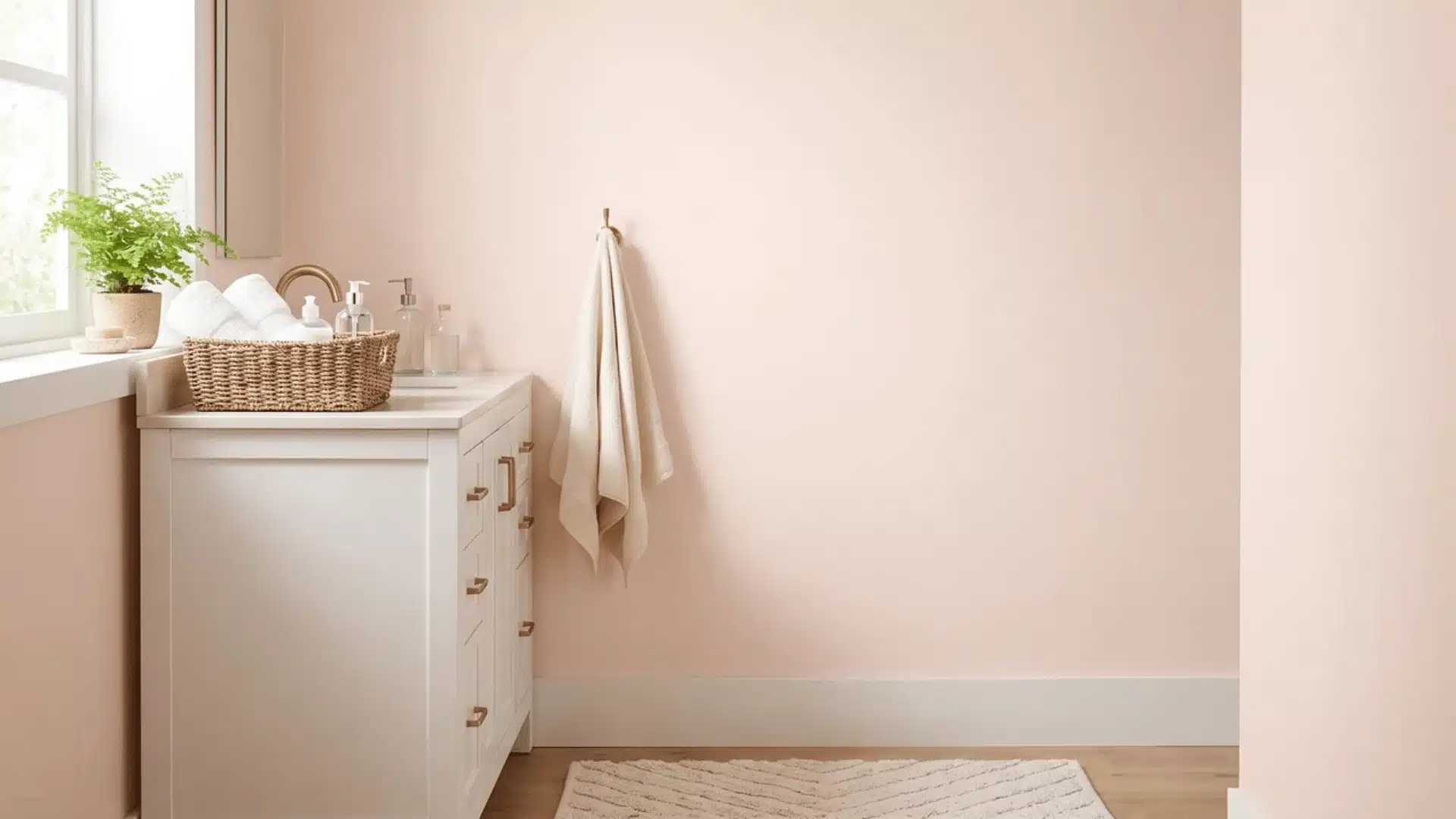
My Sweetheart sits high on the brightness scale, close to a true white but with a warm blush underneath, so it still opens up a small room the way a light neutral would.
The pink reads as an undertone rather than a bold statement, staying soft and glowy in good natural light but shifting flat under weak bulbs. This is a light-and-airy pick with personality, best reserved for a small powder room that already gets solid daylight.
Gold or brass fixtures bring out its warmth especially well.
| Color Name | My Sweetheart, RD-W03 |
| Brand | Behr |
| LRV | 82, light |
| Undertones | Warm, soft peachy-blush |
| Best For | Powder rooms with strong daylight, gold or brass fixtures |
| Avoid In | Rooms lit mostly by weak artificial light, the blush can wash out and look dull |
12. Sherwin-Williams Black Magic (SW 6991)
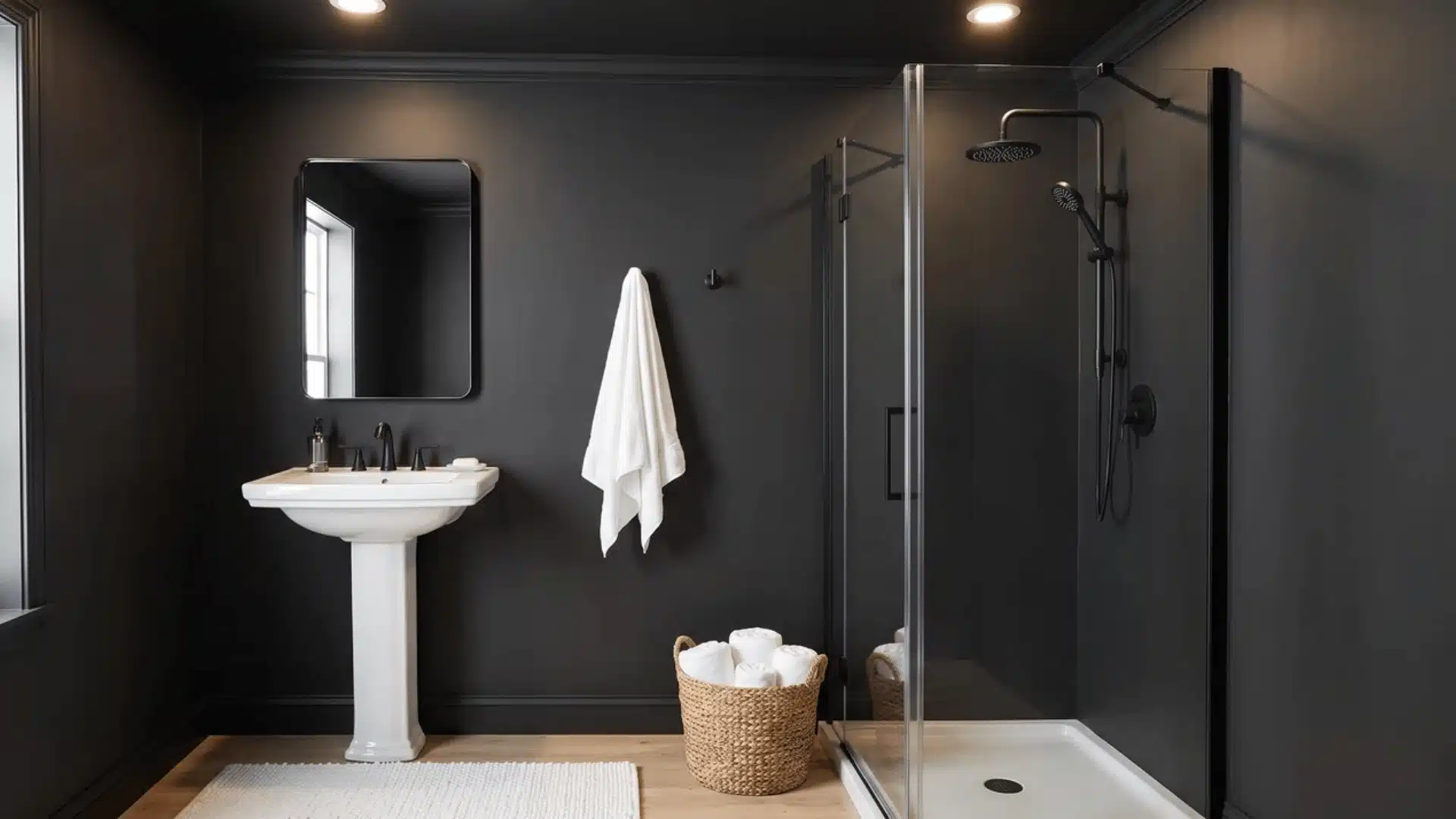
Black Magic absorbs almost all the light that hits it, making it one of the darkest options here and one built for full commitment rather than a subtle accent.
It works the same way Black Forest Green does, erasing the room’s corners when carried across walls, trim, and ceiling together. Skip that continuous treatment and it can feel heavy instead of dramatic.
A small bathroom needs a genuinely strong light source, natural or fixture-based, before this shade earns its place. White fixtures and countertops create the sharp contrast that makes it look intentional.
| Color Name | Black Magic, SW 6991 |
| Brand | Sherwin-Williams |
| LRV | 3, very dark |
| Undertones | Neutral, true matte black |
| Best For | Full wall-trim-ceiling treatment with a strong light source and white fixtures |
| Avoid In | Bathrooms with no reliable light source; it can read as a cave rather than a statement |
Matching Paint With Your Tile, Fixtures, and Vanity
Your existing fixtures aren’t going anywhere, so the wall color has to work around them, not the other way around. Tile, vanity wood, and fixture finishes all carry an undertone, warm brass, cool chrome, or beige-toned tile, and matching that undertone is what makes a color choice feel intentional instead of accidental.
| Your Fixtures | Undertone | Small Bathroom Paint Colors to Consider |
|---|---|---|
| Brass, warm wood vanity | Warm | Alabaster, Swiss Coffee, Ancient Marble, Sierra Sand |
| Chrome, cool gray tile | Cool | Chantilly Lace, Window Pane, Courtyard Blue |
| Mixed metals, neutral tile | Neutral | Ultra Pure White, Ancient Marble; test both first |
A cool gray wall next to warm beige tile can look mismatched even when both colors are fine on their own, so check the undertone already in the room before you pick a shade off a fan deck.
Choosing a Color for a Bathroom With No Natural Light
A color’s undertone shifts depending on the light it sits under, and a shade that looks right on a swatch near a window can read completely differently once it’s painted on a windowless wall lit only by bulbs.
Warm-toned LEDs are the biggest culprit; they can push cool colors like Window Pane or Breezeway toward a muddy or greenish cast that never showed up on the sample.
If your bathroom has no window, test the actual paint on the actual wall under the bulb you’ll be using, not under a showroom light. Warmer, more neutral shades like Swiss Coffee and Ancient Marble tend to hold their color better under bulb light than cool blues or greens do.
When natural light is limited, small bathroom wall colors need to work well with artificial lighting. Warm bulbs can make cool shades look muddy, while neutral or warm shades tend to maintain a more consistent appearance throughout the day.
How to Choose Your Final Color
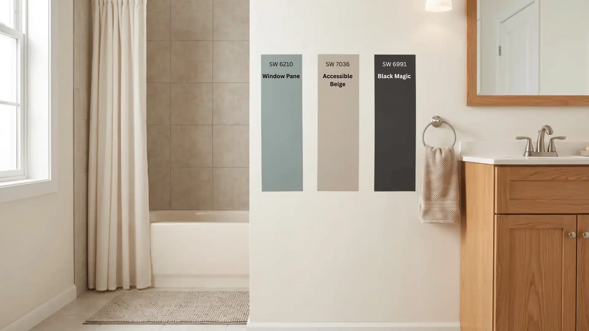
Once you’ve matched a color to your light and your fixtures, the last decision is finish, and it depends entirely on how much moisture the room actually deals with.
- Powder room, no shower: moisture stays low, so sheen becomes mostly a style choice.
- Full bath with a shower: steam and splashing water hit the walls constantly, so the wrong finish won’t hold up.
Satin or semi-gloss resists moisture better than flat or matte, which makes it the standard choice for bathroom walls no matter which of the small bathroom paint colors above you land on.
Final Thoughts
Choosing a paint color for a small bathroom is less about following a rule and more about understanding how the shade interacts with the space.
Light colors can reflect available light and create an open feel, while deeper shades can visually soften corners when walls, trim, and ceiling share one color.
Your tile, vanity, and fixtures matter too, since warm and cool undertones can either work together or clash. Lighting is especially important in a windowless bathroom, where bulbs can change how a color appears.
I’d always test your chosen shade on the actual wall before committing. Use these small bathroom paint colors as a starting point, then choose the one that fits your space and style best.
Frequently Asked Questions
What color looks best in a small bathroom?
There’s no single best color. It depends on the effect you want. Crisp white or pale aqua brightens a space. Navy or matte black makes it feel intimate.
What paint color makes a small bathroom look bigger?
Both light and dark colors can work. Light shades reflect available light outward. A single dark shade across walls, trim, and ceiling erases corners, hiding how small the room actually is.
What kind of paint is best for a small bathroom?
Color matters less than finish here. Satin or semi-gloss resists moisture and wipes clean easier than flat or matte, making it the standard pick for bathroom walls in any full bath.
What color paint is good for a small bathroom with no windows?
Windowless bathrooms rely on bulb light, which shifts a color’s undertone. Warm bulbs can push blue or sage toward muddy or green, so warm neutrals tend to read more predictably.